Introduction
Throughout this semester I have learned a lot about the design process and how important the intended user is when conceptualizing a design or physicalization. After completing the four group design sprints I have learned many valuable lessons in designing for a variety of people. My main takeaways that I followed throughout my design process are:
- •Try to account for a variety of physical perceptions of the world
- •Researching the technology you’re using is valuable to show you what's possible
- •Feedback from both informed and uninformed people is equally important
- •A strong initial plan is good but iteration can improve anything
- •It’s okay to dream big, but it is also important to manage expectations
Differences in Physical Perceptions of the World
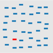
About three years ago I lost the ability to taste and smell, and it has greatly affected my perception of the world physically. Due to this experience, I tried to keep differences in perception in mind in the beginning of the design process, since there are many things that can alter someone’s perception of the physical world. This is something that can be difficult to fully account for, so I tried to narrow it down to a few main considerations. One of the main guides I found helpful was the Perception in Visualization examples.

Researching your Technology
This leads us to my second takeaway, which is to research the technology you will be using.
This concept was discussed in
Applying human-centered design to emerging technologies,
where they mention how most people focus on their current capabilities and shortcomings without fully exploring what they may be capable of in the future. When creating the haunted house experience for design sprint 3 my group had to do a lot of research into what A-Frame made possible and what alternatives were available.
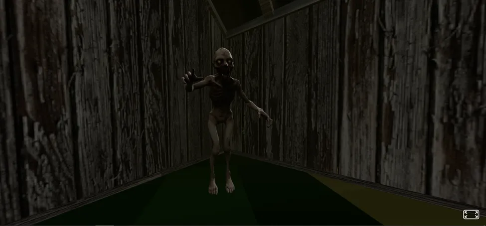
Turn down your brightness to see how hard it can be to see
One thing we struggled with a lot was animation and movement. With a little bit of research I was able to implement approximately what we wanted in JavaScript instead of A-Frame. Making our outcome a little more unconventional but ultimately a bit less time consuming to create.
Research is important in understanding what is possible with the technology you will be using, whether that be examples of more complex or animated graphs in d3, or how to set up A-Frame’s optional inspector.
Feedback
Throughout all of the design sprints we needed to get feedback,
and it was typically easiest to just ask our peers since they were already familiar with the assignment.
I found that this had pros and cons overall, sure it was faster but their level of knowledge was not something we can expect
from all users. Usability Testing 101 defines the user as a “realistic
user of the product or service being studied”, so there were a few times we tried to find a better user to get feedback from.
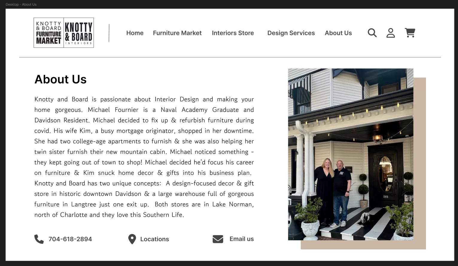
I luckily have a friend who’s mom is an interior decorator, so for design sprint 1 I asked her about our website design to see if it was similar to others she had seen. Although she wasn't the most realistic user and lacked knowledge of web design, her feedback was surprisingly helpful in refining our design, and it helped our group decide that contact information was going to be a focus of our overall design.
Another example of how a less informed user was helpful was during design sprint 2, we got feedback on our initial sketches and even though the people we asked didn’t know much about charts they were able to help with clarifying how the charts should be ordered on the page to make it easier for the viewer to get a better understanding of the overall picture.
Iteration
In the video Rapid Prototyping Google Glass, Chi talks about how the first rule to prototyping was to “find the quickest path to experience” and I found that this was very helpful advice for both the haunted house experience and the physicalization I made. When we first started actually creating the haunted house we started with a very basic room to get a better idea of how we could use the technology and what it would look like. Throughout the development we created many iterations of the scene, moving things outside and adding houses you could ‘walk’ into, and departing from the idea of a traditional haunted house.
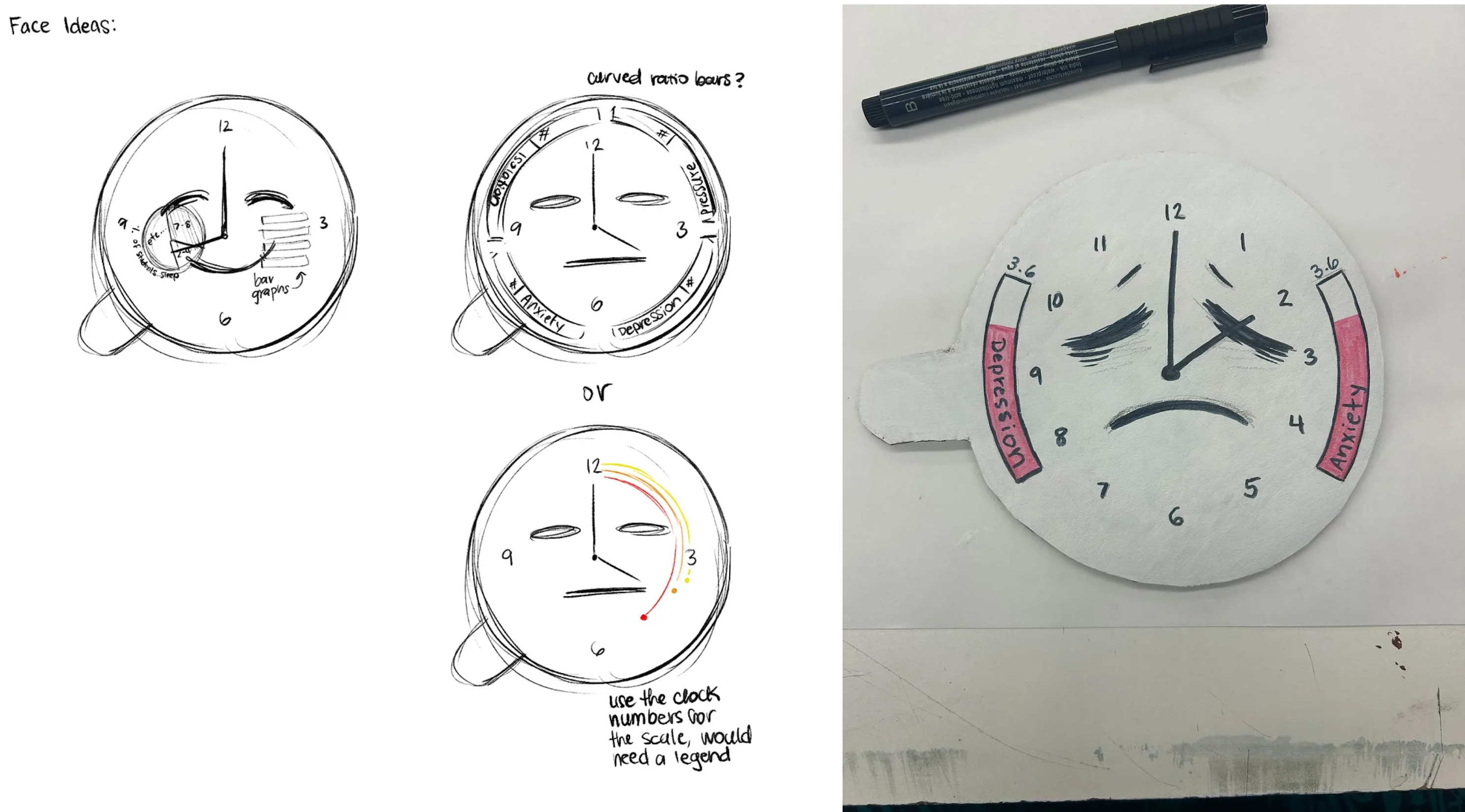
I had a similar experience with the clock physicalization. For a while I just had a red cylinder as the ‘clock’ and focused primarily on the faces and ensuring they contained all of our data in the most easily accessible way. There were multiple versions of the faces that were explored (only one physically, the rest were sketches) and this iterative design process helped me land on the best face design I could think of with the time and feedback I had.
Managing Expectations
I think everyone in the class would agree that managing expectations was a very important part of creating our final designs. In the beginning it’s easy to get carried away with a big idea that you do not have the time or the ability to actually complete. This was extremely prevalent in our haunted house experience, which ended up being nothing like the sketches we initially made. It was important to not be too disappointed by your final product, and continue to try and dream big the next time you’re brainstorming.
This problem is discussed in How to be Creative, where Ko recommends that you “externalize often. The more you express those ideas—in words, in sketches, in prototypes, in demos—the more visible those flaws will be to you and other people”. Through the process of making something, even if it’s not very good, you find that you’ll be a little better equipped to make something slightly better the next time. We only had 4 design sprints in this class, but you could tell that overall the class was improving in some form with each one. It's important not to be discouraged if your product is not as refined as you hope. Big ideas are essential for creating something truly exceptional.
Conclusion
Those are my 5 biggest takeaways that I incorporated into my design process throughout the semester. In summary, my process was researching the materials, creating multiple big initial ideas while keeping accessibility in mind, getting a variety of feedback, and then iterating on what you’re aiming to create. These takeaways helped a lot with developing my design process.
~1300 words
© 2019 All Rights Reserved. Design by Free Html Templates