
Overview:
In 2023, nearly 5 million American college students graduated from a Title-IV degree-granting institution. With this growing population, it would be beneficial to gain insight into their major choices and demographics.
Who are they? What disciplines have they chosen? Where do they go after graduation? We found an NSF database from 2010 to learn more about the basic information of U.S. college students in that year.
Who are they? What disciplines have they chosen? Where do they go after graduation? We found an NSF database from 2010 to learn more about the basic information of U.S. college students in that year.

Introduction
The objective of this data visualization project was to design a dynamic, multi-faceted dashboard that provides a comprehensive view of a dataset through two frameworks, one being more analytical and one being more persuasive, with three interconnected visualizations on each. The goal was to effectively communicate key insights while offering users the ability to explore the data from different perspectives. Each chart was carefully crafted to align with the specific properties of the dataset, ensuring clarity and relevance. By incorporating storytelling techniques and interactive elements, the design enhances user engagement, allowing for both in-depth analysis and persuasive narrative-driven exploration.
Dataset
We chose the National Survey of Recent College Graduates from NSF. We decided on this dataset because it includes clean, rich data with common demographic information such as race, gender, age, and disability status. The data was by education level (bachelor’s and master’s) and listed the number of graduates, their employment status, as well as the median salary under each category. We found this data via the CORGIS website.
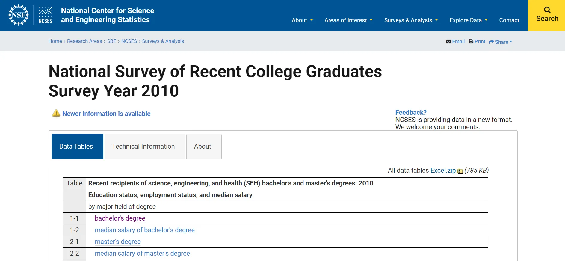
Screenshot of the NSF website
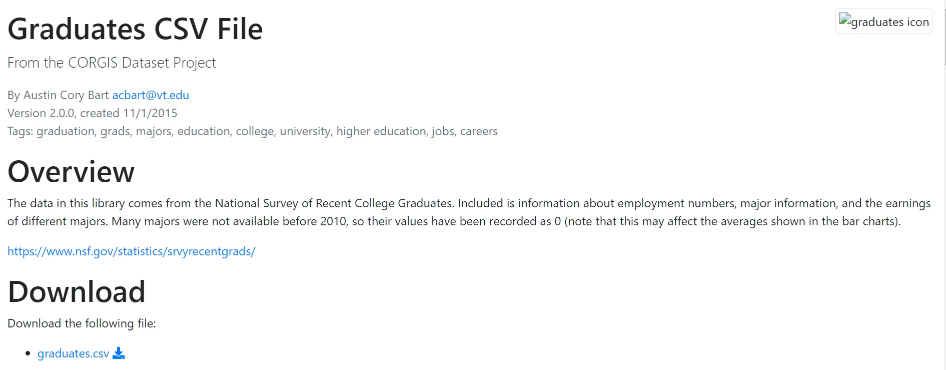
Screenshot of the CORGIS dataset page
Design method: FdS
Using the Five Design Sheet (FdS) method, we are able to “create information visualization interfaces through lo-fidelity methods.” (Roberts 2015) This method requires the designer to make 5 sketches, with Sheet 1 being the ideation sketch, Sheet 2–4 alternative designs, and Sheet 5 the realization sketch where we synthesize the best ideas from previous sketches.
Using the Five Design Sheet (FdS) method, we are able to “create information visualization interfaces through lo-fidelity methods.” (Roberts 2015) This method requires the designer to make 5 sketches, with Sheet 1 being the ideation sketch, Sheet 2–4 alternative designs, and Sheet 5 the realization sketch where we synthesize the best ideas from previous sketches.
Design
Following the Design Sprint rubrics, we approached the data visualization from two different perspectives: analytical visualization, and persuasive storytelling.
In analysis, the main task is to communicate data in a clear and efficient manner. The analytical visualization includes at least 3 different graphs and gives the reader a good idea of the information contained in the dataset while maintaining clarity and simplicity.
In persuasion, we need to find a way to present the data in the most compelling way possible. Storytelling is crucial for this persuasive visualization, and we worked to find the best strategy to frame our interpretation of the data.
Analytical Visualization
Lillian and Augie were in charge of creating the analytical visualizations. After we decided on using the Recent College Graduates dataset, we skimmed over the data and started to think about what could be interesting to look at.
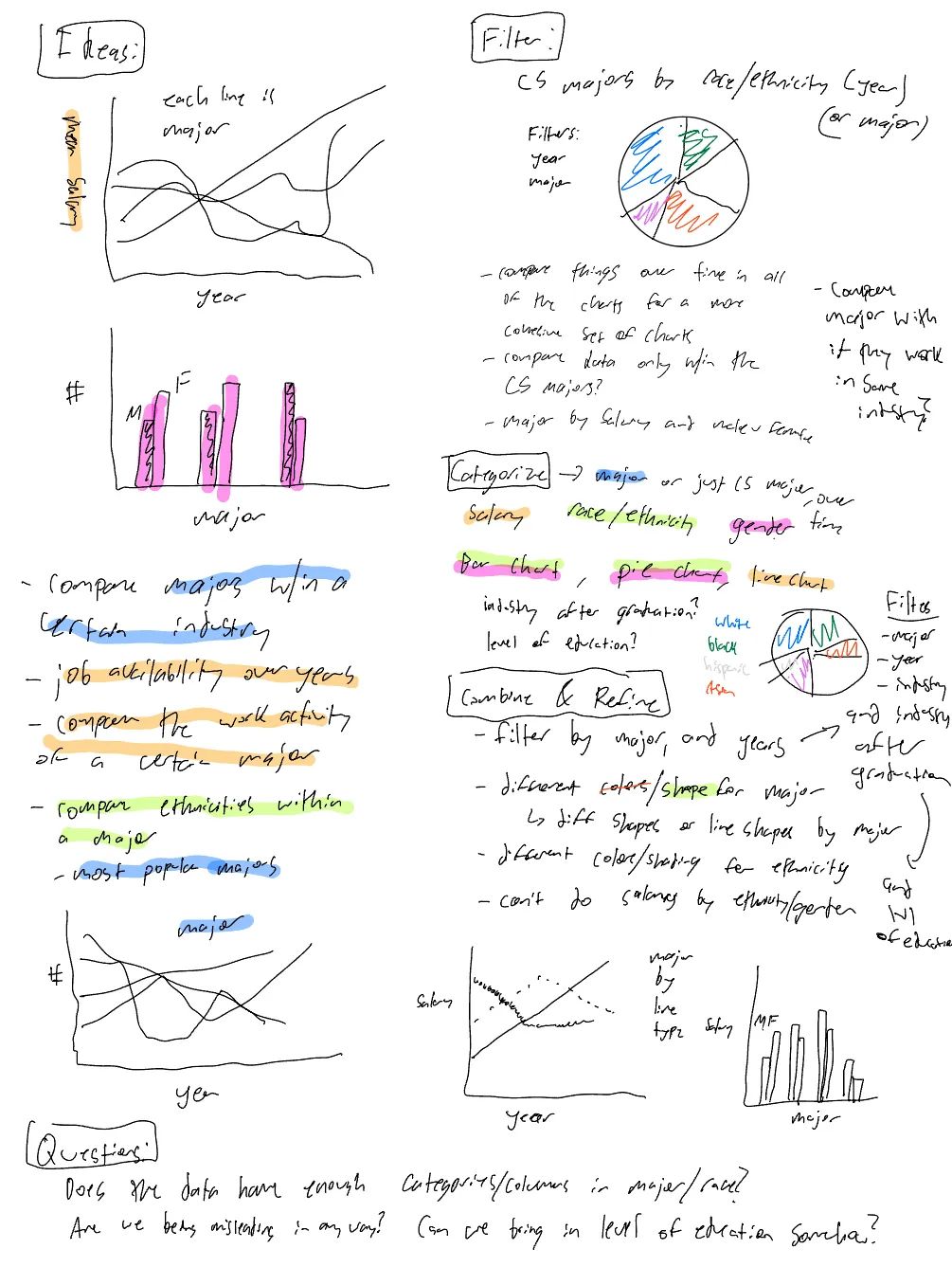
As the analytical group, we wanted to touch on all of what we thought were the key aspects of the dataset, and take different perspectives. Specifically, what we thought would be interesting was looking at different majors’ effects on available variables, such as ethnicity, gender, industry, degree of education, etc. We started organizing our thoughts by building the First Design Sheet, where we dumped all of our ideas onto a page and then started to categorize, organize and combine ideas.
Sketches
FdS #1
After putting together design sheet 1, we then started to draw out some potential layouts of our final design in sheets 2, 3 and 4, with slightly different focuses for each of them.
FdS #2–4
FdS #2–4
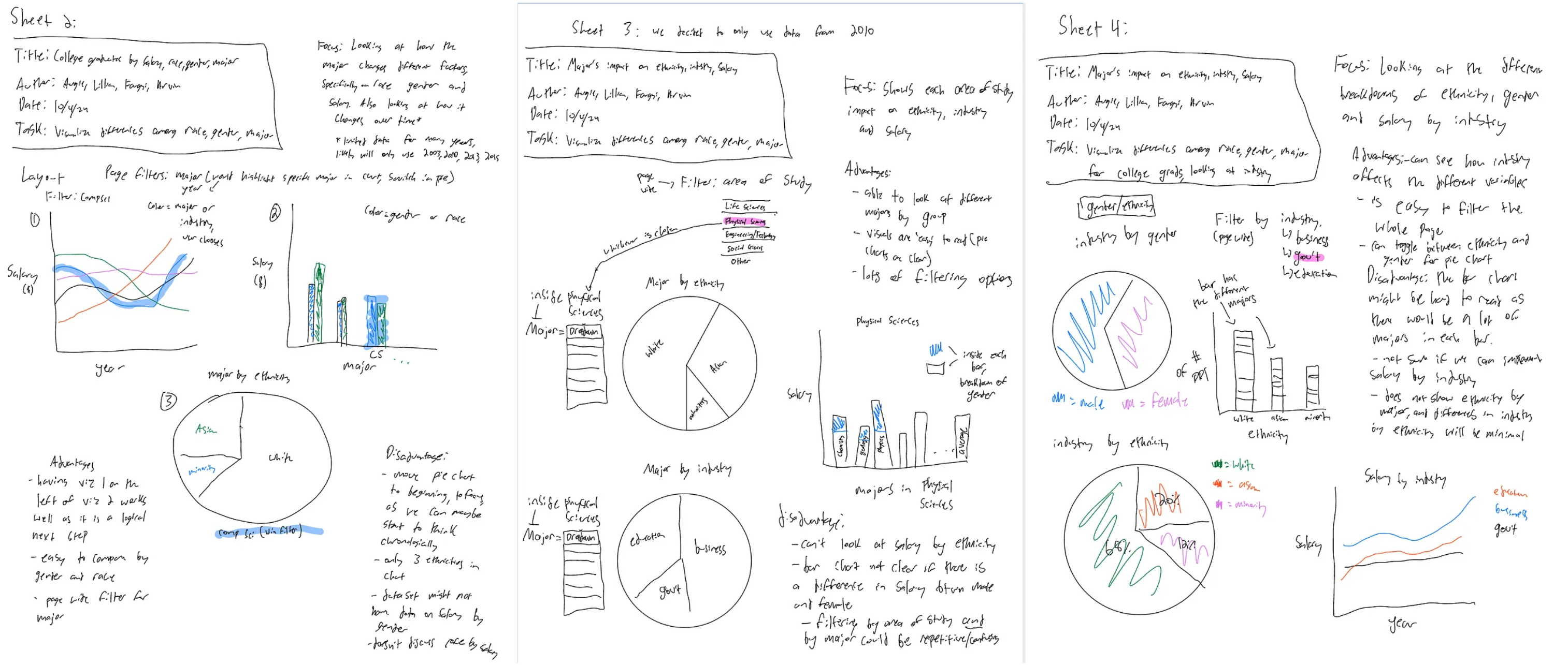
The focus on Sheet 2 was looking at the salaries by major, as well as breaking down the share of different ethnicities in the major. Also, there would be the capability to filter the whole page by a major, filtering the pie chart and highlighting the major selected in the bar chart and line chart.
In sheet three, we decided to just look at data from 2010, and also look into industry. We also changed the filtering to not be as specific — instead of filtering by major, the user would filter by area of study, which was a group of majors, allowing the user to compare inside an area of study
In sheet 4, we decided to include a page wide filter by industry, to look at how different ethnicities, genders, and salaries changed within an industry.
FdS #5
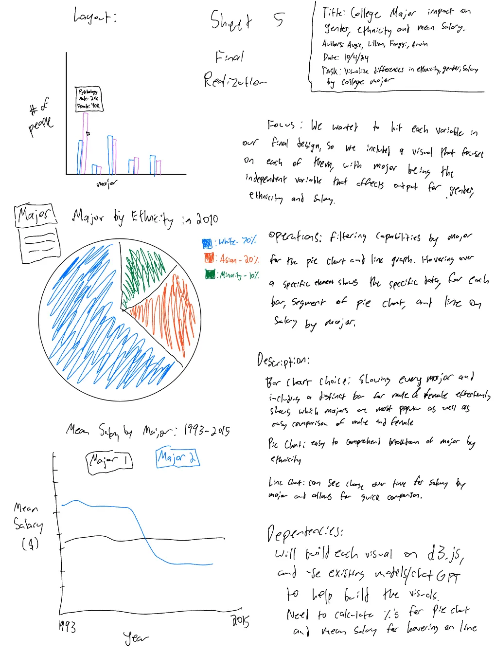
Before sketching the fifth design sheet, we wanted to get some feedback on our 2nd, 3rd and 4th sheets. After talking to friends and classmates, we heard a few things that stood out to us.
One said that it might be interesting to compare the salary of two majors as it was overwhelming to think about all the majors (as there are a lot) on one chart. A few people had different preferences on how to filter the pie charts — some preferred by major and others by industry, but no one preferred area of study.
Layout-wise, someone said that they preferred having the bar chart first, as it gives an idea of which majors are most popular before examining the details of that major, such as gender, ethnicity, and salary. As a result, this is how our fifth design sheet turned out.
Implementation
To implement the design outlined in Sheet 5 into d3.js, we built a bar chart, pie chart and line chart to highlight the impact of college majors on gender, ethnicity, and mean salary.
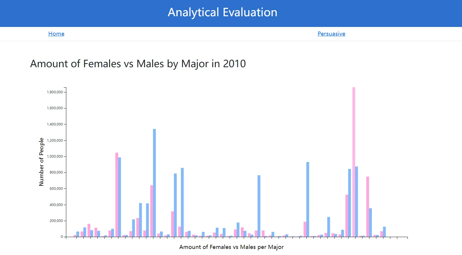
The bar chart was developed to display the number of graduates per major, with distinct color-coded bars representing male and female students. This allowed users to compare gender representation across different fields, as well as compare total counts within each major.
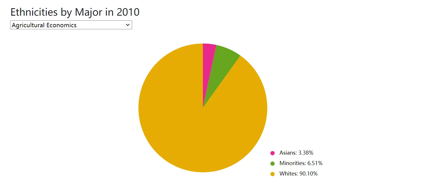
A pie chart was built to show the breakdown of ethnicities for each major, using proportional segments to visualize representation. A key was included to show which color represented each ethnicity, as well as showing the exact percentage the ethnicity represented in the major.
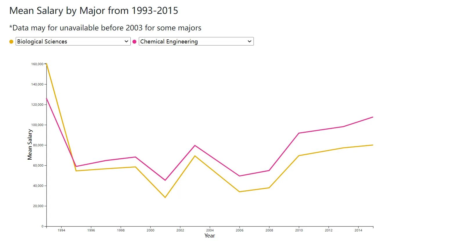
Additionally, a line chart was included to illustrate changes in mean salary over time for two selected majors, allowing users to observe and compare trends from 1993 to 2015. The first two are designed with interactive capabilities; specifically, a tooltip pops up which displays data for the specific bars or pie segments. Though we wanted to add this pop-up display on the line chart, we ran into some coding problems when trying to get it displayed.
We used ChatGPT, other existing visualizations as reference, and Lillian’s knowledge and experience from the Data Visualization course to help build these 3 visuals.
We’re hosting our website using GitHub Pages. To launch this website we added 3 HTML pages: an index, a page for the analytical visualizations, and a page for the persuasive visualizations. The HTML files mostly contain structural elements as well as links to the style sheets, and JavaScript files. Since we were coding in 2 groups we have separate CSS style sheets which were added to the repository. We also separated the visualizations into different JavaScript files to keep things more organized. The website was launched from the main branch of the GitHub repository once we had a prototype created, and was updated through incremental pushes to the repository.
Persuasive Storytelling
Arvin and Fangyi were in charge of creating persuasive visualizations. Following the Five Design Sheet (FdS) methods, we first drafted out our ideas (ideation), created 3 alternative interfaces with each including 3 different visualizations, and combined our best ideas in the final design sheet (realization).
When browsing through the data, we noticed that the median income for men and women are significantly different. This finding led us to create visualizations that focus on the gender inequality in Science, Engineering, and Health (SE&H) for graduates in the US in 2010. We then explored the number of male and female graduates, as well as their employment status after graduation. Critical gender gaps are prevalent among all aspects in the data. Therefore, for persuasive storytelling, we decided to create data visualizations on gender inequality in college graduates in the US.
Sketches
FdS #1
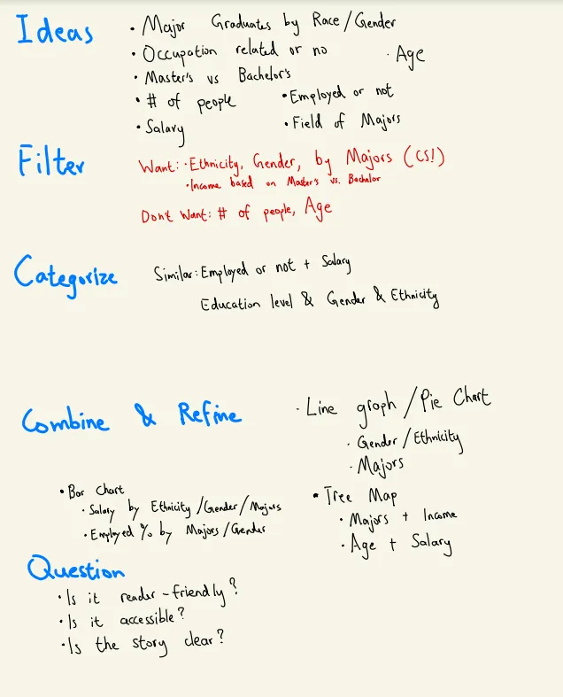
In Sheet 1, we ideated different ways to organize information in the dataset and create data visualizations. Following the FdS method, we first jogged down all categories of data from the NSF, filtered out the unwanted information, and combined and refined three visualization ideas.
Additionally, we identified 3 critical questions for our design: is it reader friendly, accessible, and clear in storytelling?
FdS #2–4
Additionally, we identified 3 critical questions for our design: is it reader friendly, accessible, and clear in storytelling?
FdS #2–4
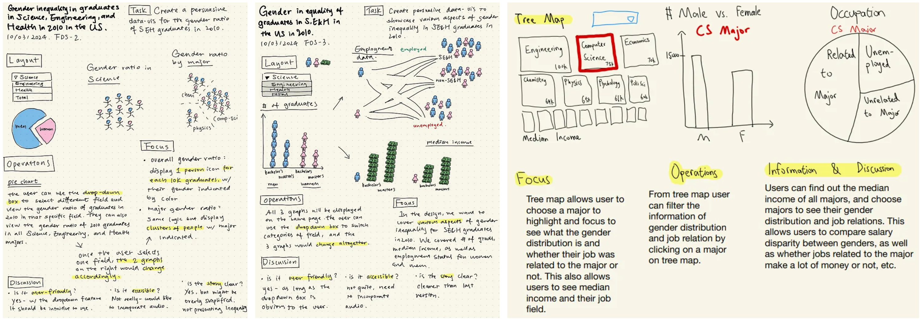
From Sheet 2 to 4, we experimented with different data visualization strategies, in order to compare and choose the most compelling combination to develop into our actual website.
In Sheet 2, we focused on creating visualizations on the number of graduates in SE&H for men and women in 2010. We used a pie chart and clusters to showcase the difference in the number of graduates for men and women.
In Sheet 3, we focused on displaying different aspects of gender inequality for graduates in SE&H. We included a bar chart with icons of men and women to represent the number of college graduates, sorted by degrees. A dropdown menu allows the user to switch between different industries, or view the total numbers combined. A separate bar chart represents the median income for men and women in those industries. Lastly, a road map displays the employment status of the college students after graduation, with icons of different colors representing the gender ratio under each circumstance.
In Sheet 4, we created visualizations that focus on different aspects of specific majors. A treemap represents different majors, with the size of each block corresponding to the median income for each major. Again, the user can click the dropdown menu and switch between industries. Once the user clicks a block in the treemap, the bar chart on the right would display the gender ratio in graduates of that major. The pie chart would change accordingly as well, showing the percentage of graduates under each employment category.
FdS #5
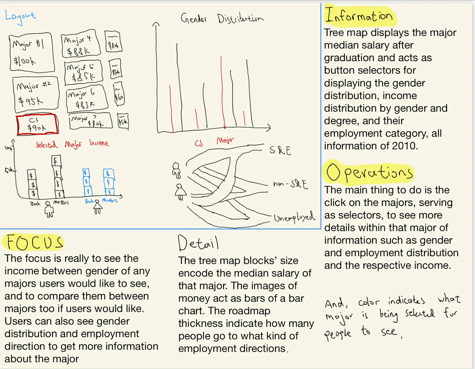
Before drawing Sheet 5, we met and discussed the ideas in Sheet 2–4 and picked the best visualizations to tell the story.
We combined the design in Sheet 3 and 4, chose 4 graphs, and articulated the designs in Sheet 5. Since we displayed different majors, rather than fields, in the treemap, we adjusted the graduate population, median income, and employment status accordingly.
Implementation
Based on Sheet 5, we built the persuasive visualizations. Using d3.js, we were able to build 3 of the 4 graphs in Sheet 5. We did not implement the road map visualization because of the complexity and time constraints.

To improve the clarity and accessibility of our visualizations, we made several adjustments. At first, the treemap was green and red, and the strong contrast between the opposite colors made the information hard to read. We changed the color combination to blue and red to increase readability for potentially color-blind users, while keeping the high contrast between colors across the board.
Further, we designed our dashboard in a way that is both user-friendly and provides a clear visualization revolving around our theme. When the user first arrives at the page, the block representing median income across all majors is auto-selected and appears red, giving the user a holistic idea about how to navigate the treemap. We used bar chart to display the number of graduates for men and women to offer a clear comparison, and we chose to use a line graph to show differences in median salary for graduates across different degrees, so that the user could easily understand the correlation between education and salary, as well as how gender mediates this relationship. Since the treemap dynamically changes the other two graphs, the user can navigate our page fairly easily.
While building the graphs, we prompted ChatGPT to give us the code in JavaScript. However, AI wasn’t not very helpful since it couldn’t fully comprehend our commands for most of the time. Therefore, we manually programmed to implement our ideas. Additionally, Arvin used skeleton files from his previous coursework, Data Visualization.
Demo
Below is the link to homepage for our visualizations.
Click Me!
Below is the demo video of our project.
Click Me!
Click Me!
Below is the demo video of our project.
Click Me!
Feedback
On October 9, we gave a live demo to other students and Dr. Williams in class. We were able to gather valuable feedback from them.
For the analytical visualization, the tooltip appeared far away from the pie chart when the user hovers the mouse over, which makes it harder to connect specific statistics with the actual pie chart. For the persuasive visualization, it would be great if we can differentiate the shades and sizes of blocks in the treemap, thus making a clearer distinction between different industries, as well as better representing the income differences.
Although we weren’t able to implement these changes due to time constraints, they would help us improve the clarity and efficiency of our visualization.
Conclusion
Through this project, we were able to build visualizations from the same dataset that convey divergent messages to the user. The FdS method helped us to articulate our design, and we benefited from the different skill sets of our group members. Upon solving various problems, we deepened our understanding of user-centered design and accessibility. Feedback from Dr. Williams and our classmates pointed out aspects that we have overlooked while developing the visualization.
The NSF dataset provided an interesting and relevant topic for us. We gained knowledge about college students’ choice of majors, demographic information, and career paths, and in the process honed our design, programming, and group work skills.
The NSF dataset provided an interesting and relevant topic for us. We gained knowledge about college students’ choice of majors, demographic information, and career paths, and in the process honed our design, programming, and group work skills.
Citations
Roberts, Jonathan C., Chris Headleand, and Panagiotis D. Ritsos. “Sketching designs using the five design-sheet methodology.” IEEE transactions on visualization and computer graphics 22.1 (2015): 419–428.