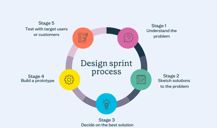
Design sprint process
Overview:
Knotty & Board is a local interior design company, and while their designs may be beautiful, their website could do a better job reflecting this. We were tasked with redesigning two pages from their website for three dimensions: desktop, Apple Watch, and a large multi-touch display. We decided to prioritize one of the larger groups in Knotty & Board’s target audience: older homeowners. We felt that this group would struggle the most with their current website and could greatly benefit from a redesign that would simplify the overall experience.
Information Design:
When conceptualizing a new Knotty & Board website, we first considered what to emphasize. We understood that our target audience, particularly older people, value easy access to information. Therefore, it was crucial that important details, such as locations, phone numbers, and email address were immediately visible and easy to find.
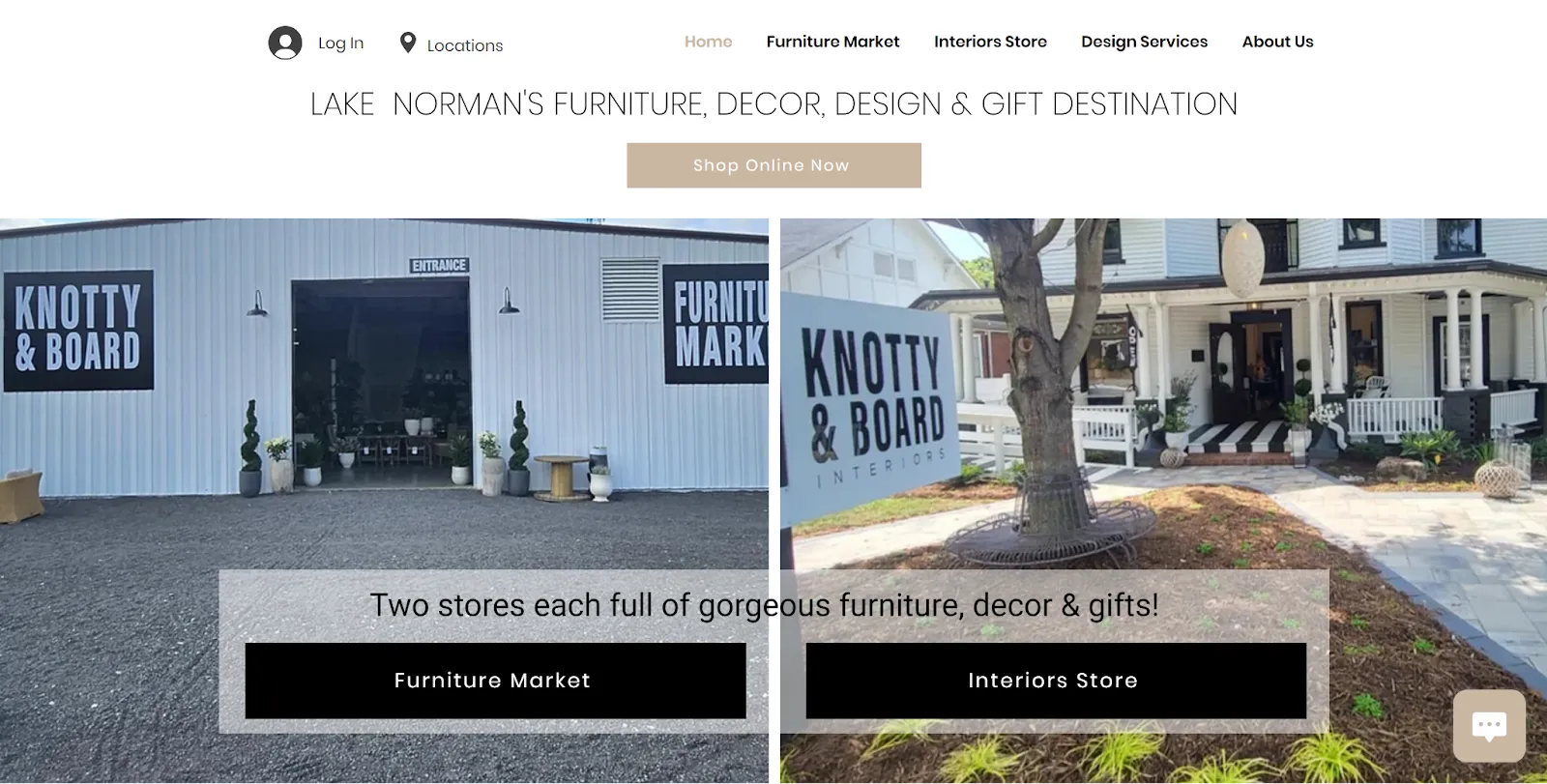
Homepage of Knotty & Board's website
The current version of the website does not highlight that information, instead placing a greater focus on their online store. While you can scroll down to find their address and hours, other important information like their phone number and email address cannot be found on the homepage. We found this odd since they don’t ship furniture, meaning most customers will need to contact them and visit in-person.
Another issue we noted was how overwhelming certain pages are. The “About Us” page starts off strong but quickly becomes difficult to navigate. Elements like the “Get In Touch With Knotty & Board” section are split oddly, and some text is borderline unreadable. A strong “About Us” page is critical for creating a connection with customers, so its readability and clear layout are paramount.
Another issue we noted was how overwhelming certain pages are. The “About Us” page starts off strong but quickly becomes difficult to navigate. Elements like the “Get In Touch With Knotty & Board” section are split oddly, and some text is borderline unreadable. A strong “About Us” page is critical for creating a connection with customers, so its readability and clear layout are paramount.
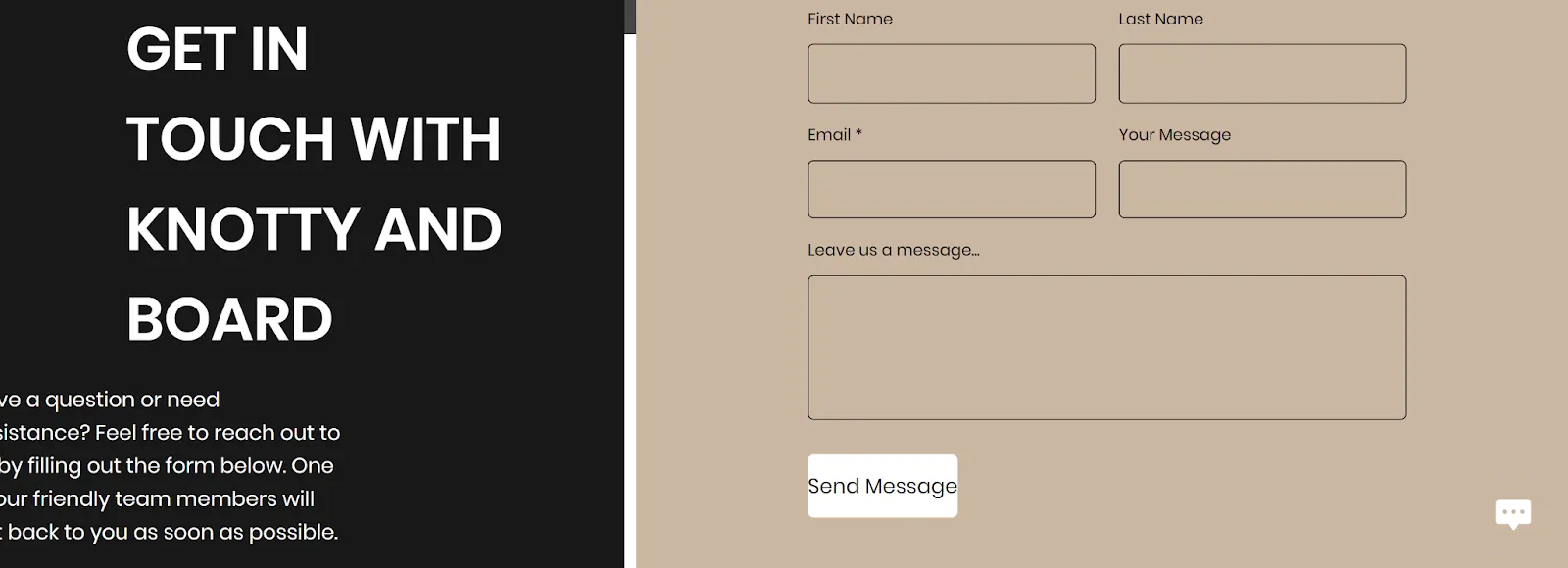
Knotty & Board's “About Us” page contains text that flows off the screen
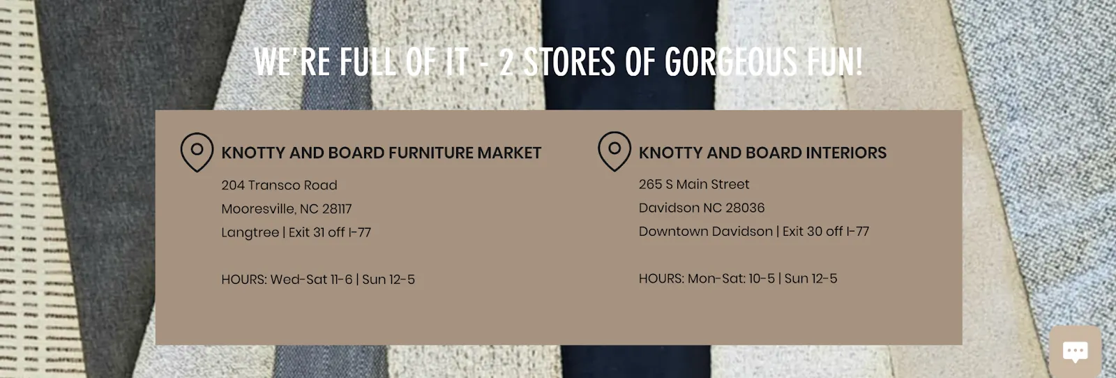
Some text is difficult to read on a similar colored background
To address the identified issues and enhance the overall user experience, particularly for our target audience of older homeowners, we developed a new design with specific goals in mind. Our approach focused on:
- 1. Incorporating clearer sections with less overlapping imagery
- 2. Keeping information on each page visible and accessible
- 3. Prioritizing contact information and store details on the homepage
- 4. Improving the readability and layout of key pages like “About Us”
Through an iterative process of integration testing, we refined each sketch, gradually improving the interface to strike the right balance between aesthetics and functionality. This approach allowed us to develop our initial concepts into a finalized prototype, which we then implemented in Figma. The result is a design that not only looks appealing but also significantly enhances usability, ensuring that Knotty & Board’s website better serves its customers and reflects the quality of their interior design work.
Homepage: Desktop
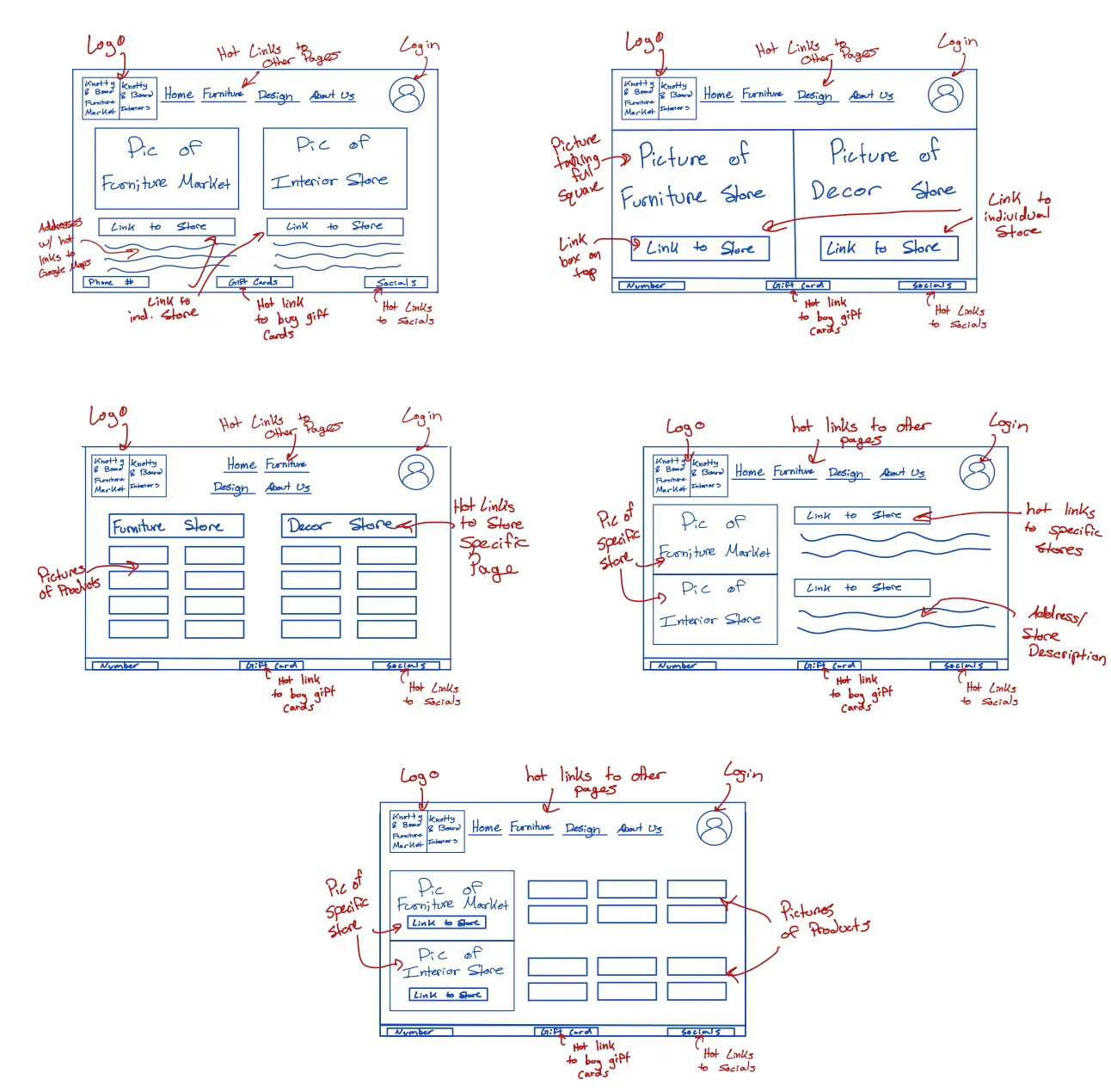
Sketches for the desktop homepage
Sketch 1: Separated furniture and interior design stores with links, service descriptions, and a bottom panel for contact info and social links. We liked the store separation, bottom panel, and clean top section with logo and navigation.
Sketch 2: Experimented with filling the entire screen without a description while maintaining store separation. We liked the minimalism of removing the description.
Sketch 3: Tested showing products instead of store images but felt this detracted from the store’s overall vibe.
Sketch 4: Shifted to a horizontal layout with store sections side by side, which we preferred over the vertical separation.
Sketch 5: Added pictures with more spacing, which improved the visual appeal and became a key design choice.
Ultimately, we decided to incorporate Google Maps while retaining the horizontal layout, solidifying the structure for the final prototype.
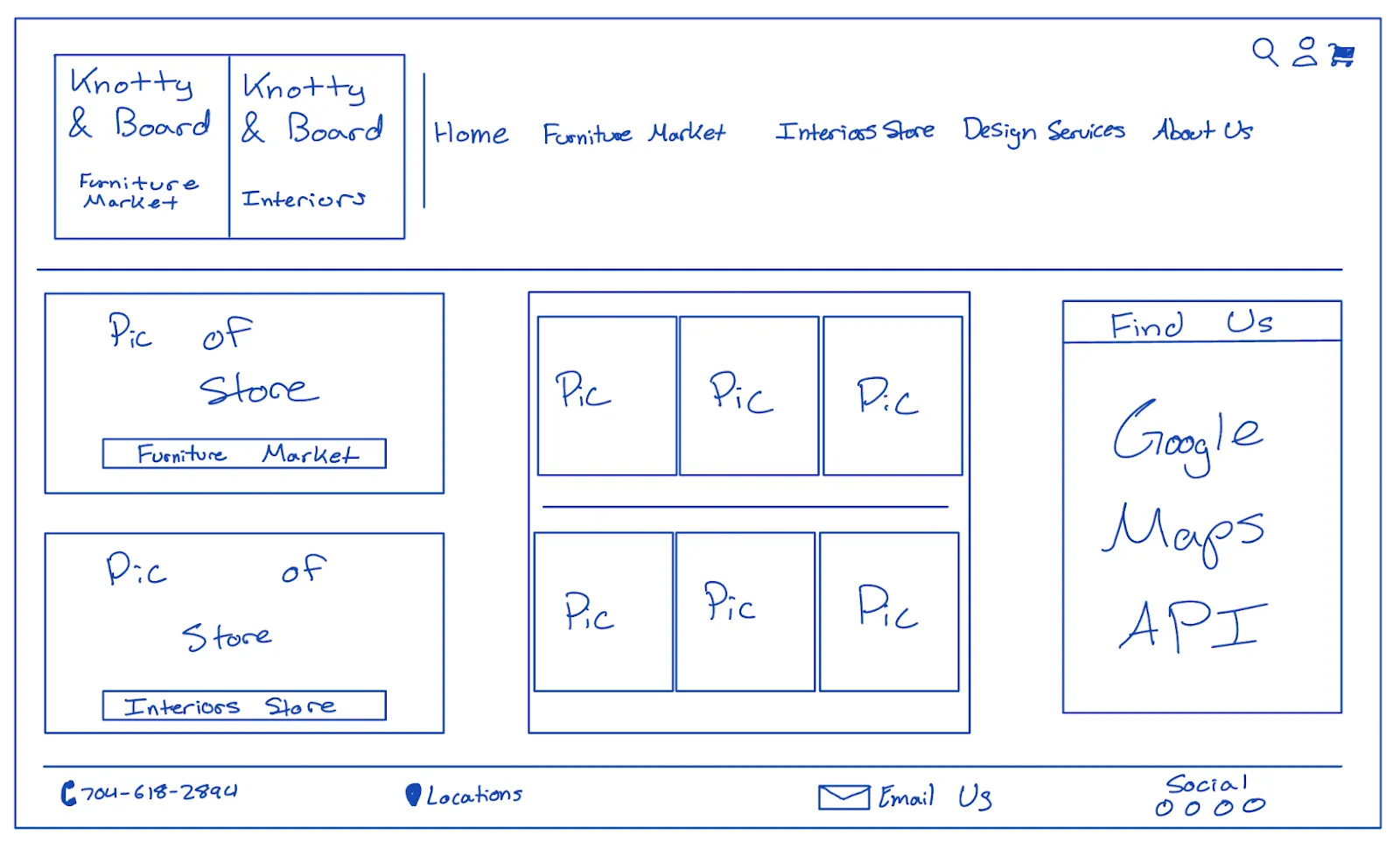
Final prototype for desktop homepage
The final desktop landing page separates the furniture and interior design stores in a horizontal layout featuring the store front picture, navigation to specific sight, and top items for the furniture store up top and interstore on the bottom. A Google Maps API was added to the right side to enhance functionality, and the featured sections were made larger for better visual appeal. This design ensures easy navigation while maintaining a polished, organized layout. Unlike the current version, our new design offers intuitive navigation, and it matches the atmosphere of the store and its offerings.
Homepage: Multi-touch Display:
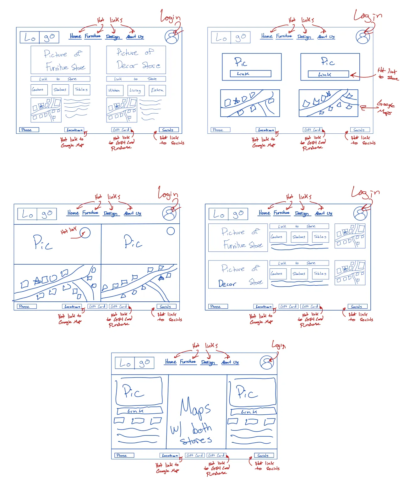
Sketches for the multi-touch display homepage
Sketch 1: Displayed stores side by side with small map locations and featured sections. We liked the featured sections but found the map too small.
Sketch 2: Focused on enlarging the map by removing section headers and only showing a picture with a link. However, we disliked the absence of section headers and felt it underutilized the large screen.
Sketch 3: Expanded the layout from sketch 2 to fill the entire screen but still felt it didn’t take full advantage of the large display.
Sketch 4: Switched to vertically stacked sections, reintroducing section headers. However, we did not like the vertical separation.
Sketch 5: Added a Google Maps feature as a central divider, improving organization and allowing for more prominent featured sections.
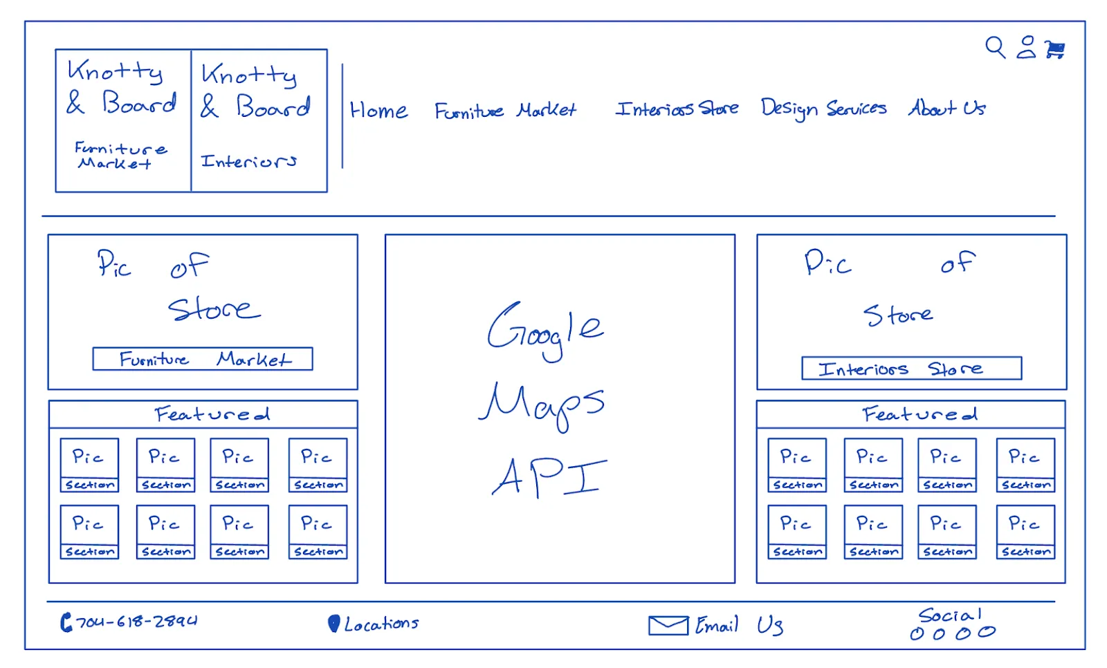
Final prototype for multi-touch display homepage
For the large multi-touch display, the final design includes a horizontal layout with a central Google Maps API to break up the space visually. The “Featured Sections” were made larger with section headings enabling the user to navigate more specifically into the products of each store as well as to fully utilize the large screen. This design provides users with a visually engaging and functional experience in a larger format.
Homepage: Apple Watch:
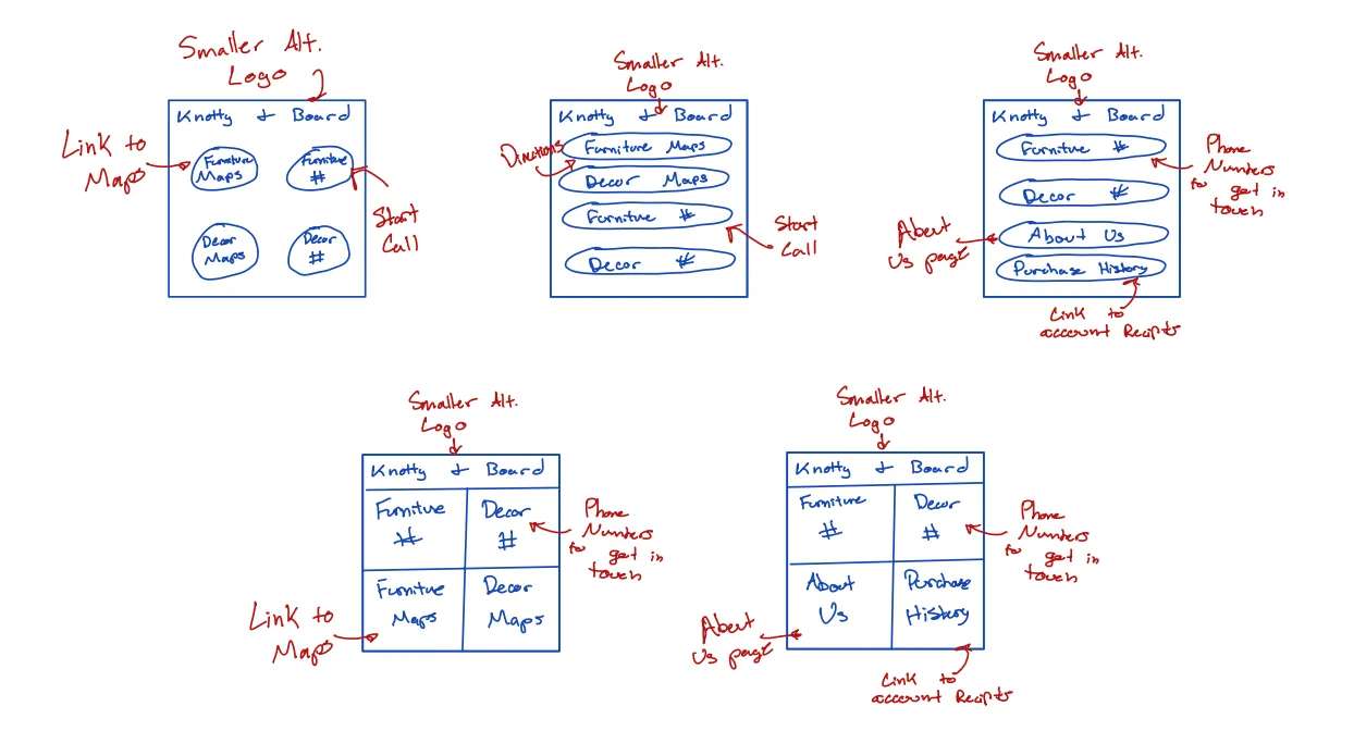
Sketches for the Apple Watch homepage
Sketch 1: Featured four circles arranged in a 2x2 grid with buttons for directions to each store and phone numbers, focusing on simplicity for users needing contact or directions.
Sketch 2: Similar structure with four vertically stacked buttons for directions and phone numbers.
Sketch 3: Replaced the buttons with two phone numbers, an “About Us” section, and purchase history.
Sketch 4: Returned to the original four sections but used a box format filling the entire screen.
Sketch 5: Implemented the second iteration of the four sections in the full-screen box format again.
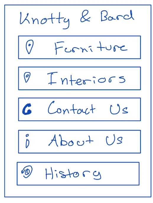
Final prototype for multi-touch display homepage
The final Apple Watch landing page features a streamlined design with vertically stacked buttons for store directions, a single phone number for the stores, an “About Us” section, and purchase history. This approach caters to the limited screen space of the Apple Watch while providing users with small, manageable bits of information. It utilizes the watch’s limited functionality effectively, ensuring that users can quickly access the most important features without overwhelming the interface.
About Us: Desktop:
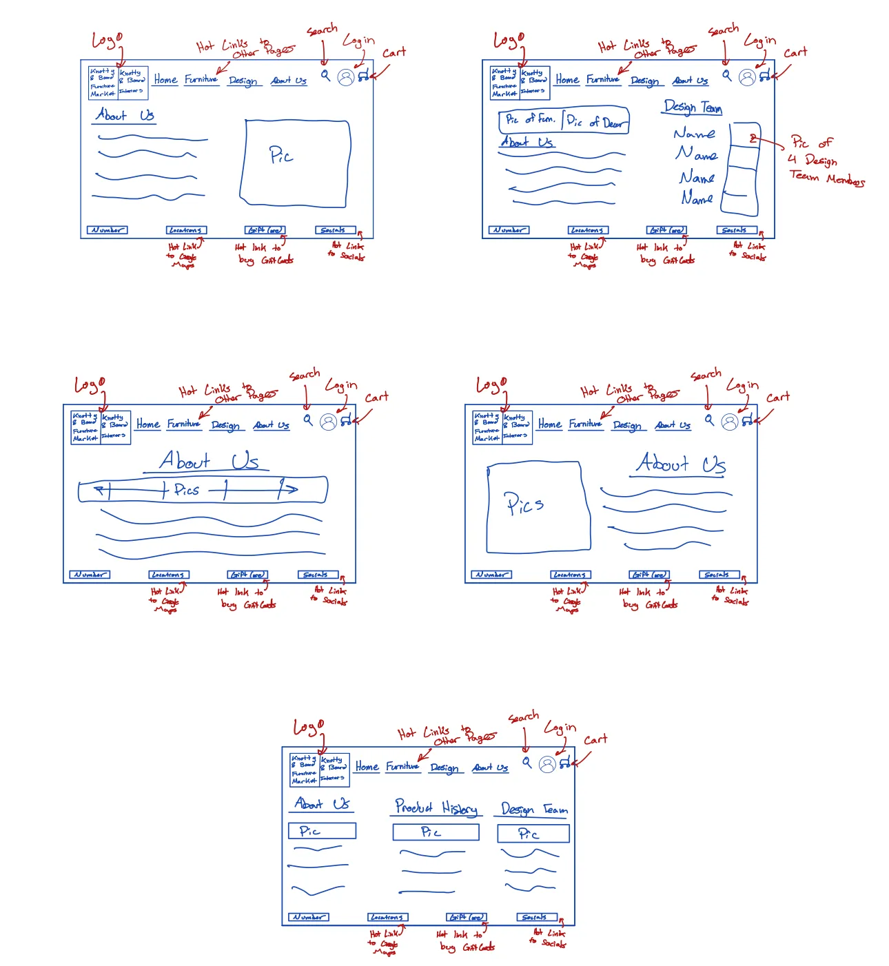
Sketches for the desktop “About Us” page
Sketch 1: Featured an “About Us” page with a picture of the management team and a written description, keeping the same header and footer as the desktop website.
Sketch 2: Replaced the management team picture with images and information about the design team instead.
Sketch 3: Displayed a horizontal layout with a line of pictures of the management team and the rest of the screen filled with “About Us” information.
Sketch 4: Similar to Sketch 1 but with the picture moved to the right side instead of the left.
Sketch 5: Included a smaller “About Us” section, a design team section, and a purchase history section, with clear separation between each section.

Final prototype for desktop “About Us” page
The final desktop version of the “About Us” page includes a compact write-up about the company, as well as a picture of the management team. The bottom bar enables the user to access additional information including the phone number, locations, and an “Email Us” section for further contact. This layout provides clarity, separating key pieces of information while maintaining an abundance of relevant information for a user learning about the company.
About Us: Large Multi-touch Display:
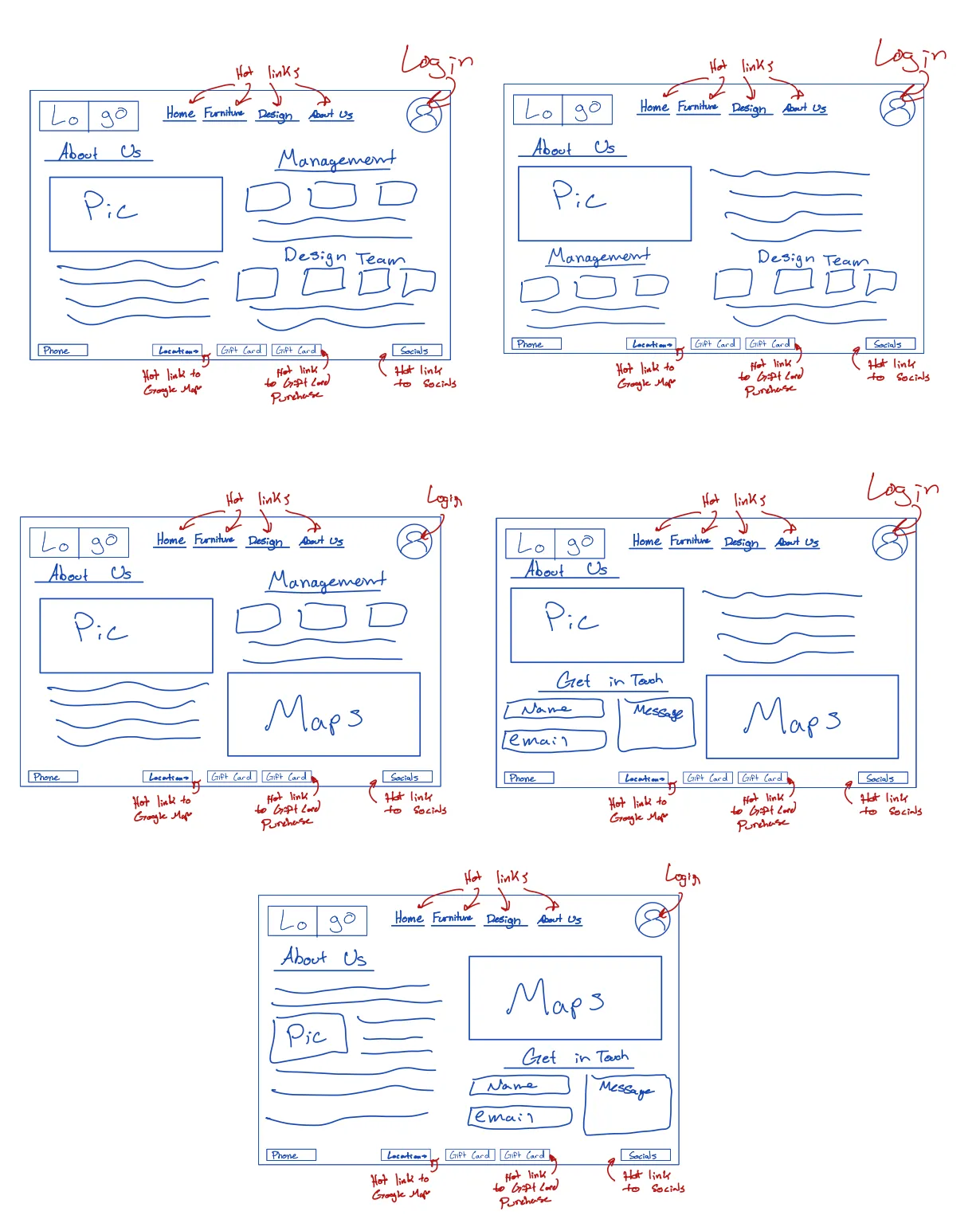
Sketches for the multi-touch display “About Us” page
Sketch 1: The left side featured a picture of the store team with company information below, and the right side was split into two vertically stacked sections for the management and design teams.
Sketch 2: Placed the “About Us” picture and description on the right, with the management team information below and the design team to the right. However, this felt cluttered and disorganized.
Sketch 3: Featured a picture of the management team with a description on the left and the management team info and maps to the store on the right, which we liked for its clarity.
Sketch 4: Introduced a “Get in Touch” section, which we liked but were unsure about the overall layout.
Sketch 5: Integrated sections better, with “About Us” text surrounding a picture, maps for store locations, and a “Get in Touch” section.
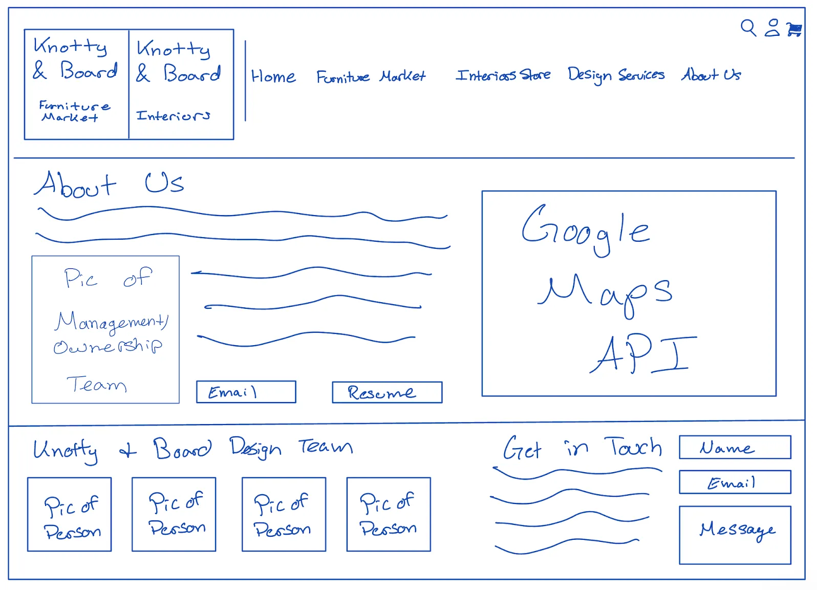
Final prototype for multi-touch display “About Us” page
The final design for the large multi-touch display maximizes space while maintaining clarity. It features a management team picture integrated into the business description, interactive store maps for easy location, and a prominent “Get in Touch” section. We added detailed information about the design team to fully utilize the display and showcase the talent behind Knotty & Board. This layout combines visuals and information, creating an engaging overview of the store. This results in an informative experience and leverages the multi-touch display’s capabilities.
About Us: Apple Watch:
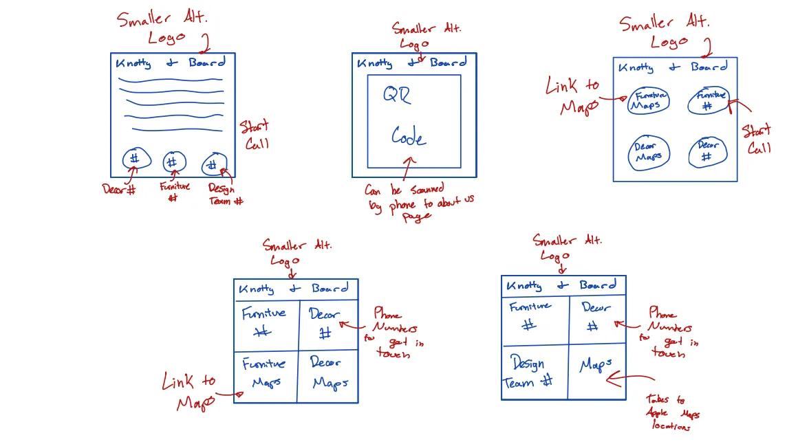
Sketches for the Apple Watch “About Us” page
Sketch 1: Included a small written description followed by phone numbers to contact the stores and design team, but we found the text too difficult to read on an Apple Watch.
Sketch 2: Used a QR code to scan and access the “About Us” page on a phone but felt this wasn’t in line with the assignment’s intent.
Sketch 3: Featured store phone numbers and maps, similar to the home page, but we felt it was redundant.
Sketch 4: Same as Sketch 3 but in a box layout, which again felt repetitive since it mirrored the home page.
Sketch 5: Added the design team’s number along with maps to both locations.
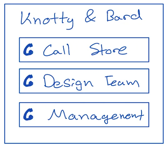
Final prototype for Apple Watch “About Us” page
The Apple Watch “About Us” page was simplified to include only the essential contact numbers: design team, store front, and management. This decision focused on providing users quick access to important contacts without overwhelming them with unnecessary details, making it ideal for a watch interface.
Moodboard:
Before we started our final design, we made a moodboard to lay out the colors, fonts, and general style we wanted. We decided that we wanted to keep the majority of the colors from the site the same, and we looked for examples of minimalist websites with subtle color palettes. This moodboard served as a guide while designing in Figma, and it ensured that we maintained a similar atmosphere to Knotty & Board’s current website.
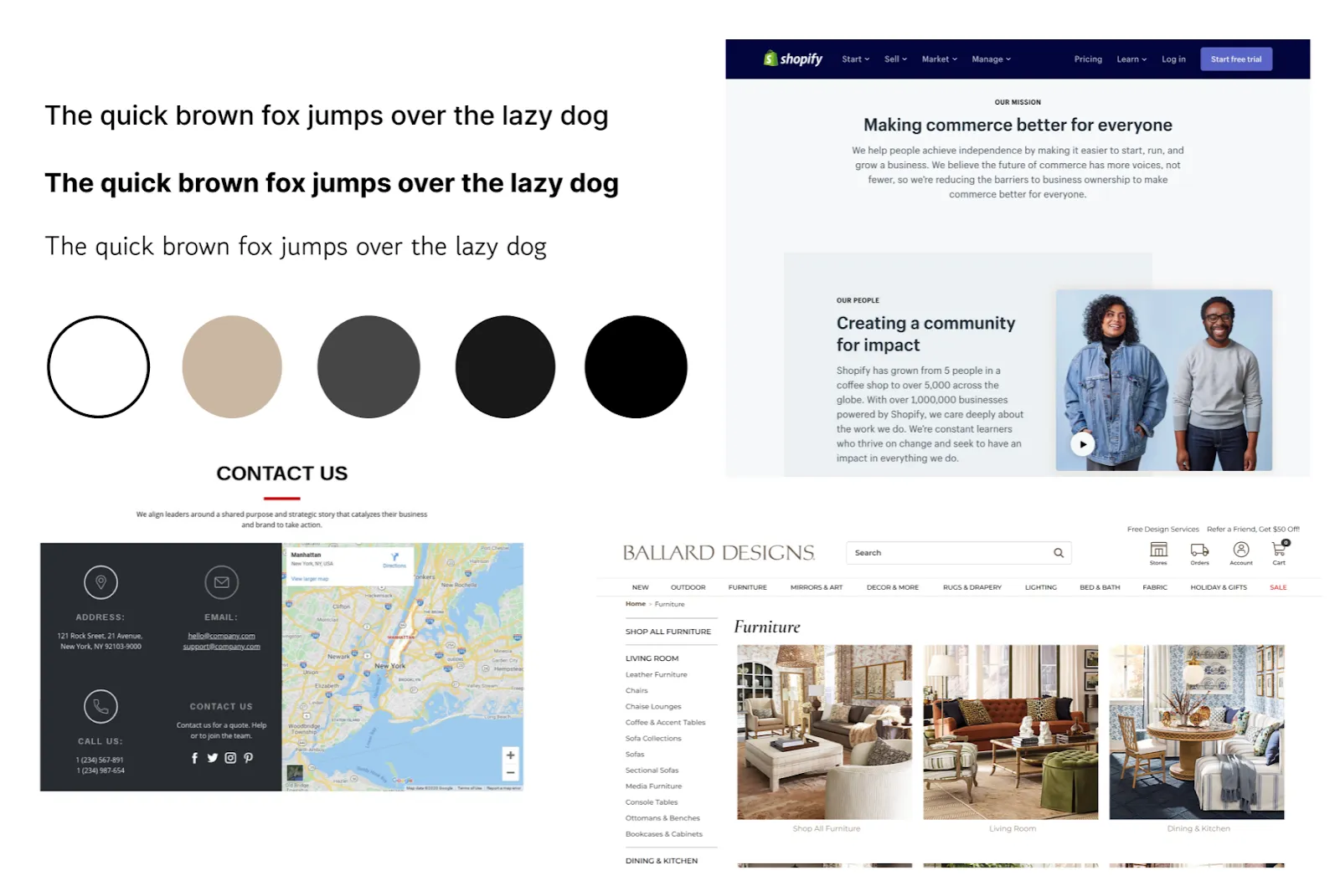
Moodboard for our design
Designing in Figma:
After refining our sketches and creating a moodboard, we transitioned to Figma for the final design phase. We translated our prototypes into polished designs and implemented the color palette from our moodboard. We wanted to ensure that the website was accessible for our audience of older homeowners, so we paid close attention to font size and color contrast. Our designs created an intuitive and visually pleasing experience for potential users on the Knotty & Board website.
Desktop Designs:
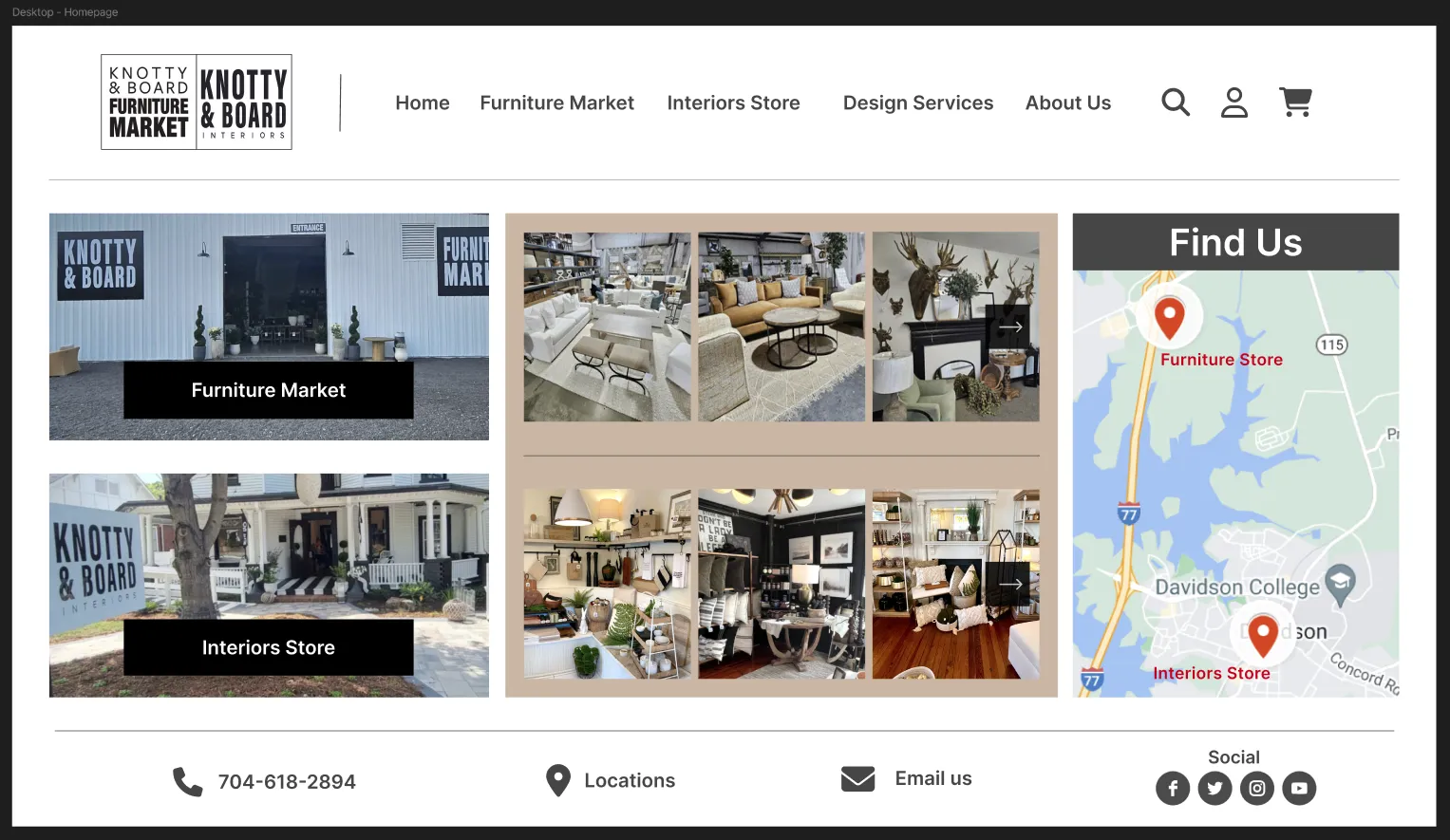
Desktop homepage Figma design
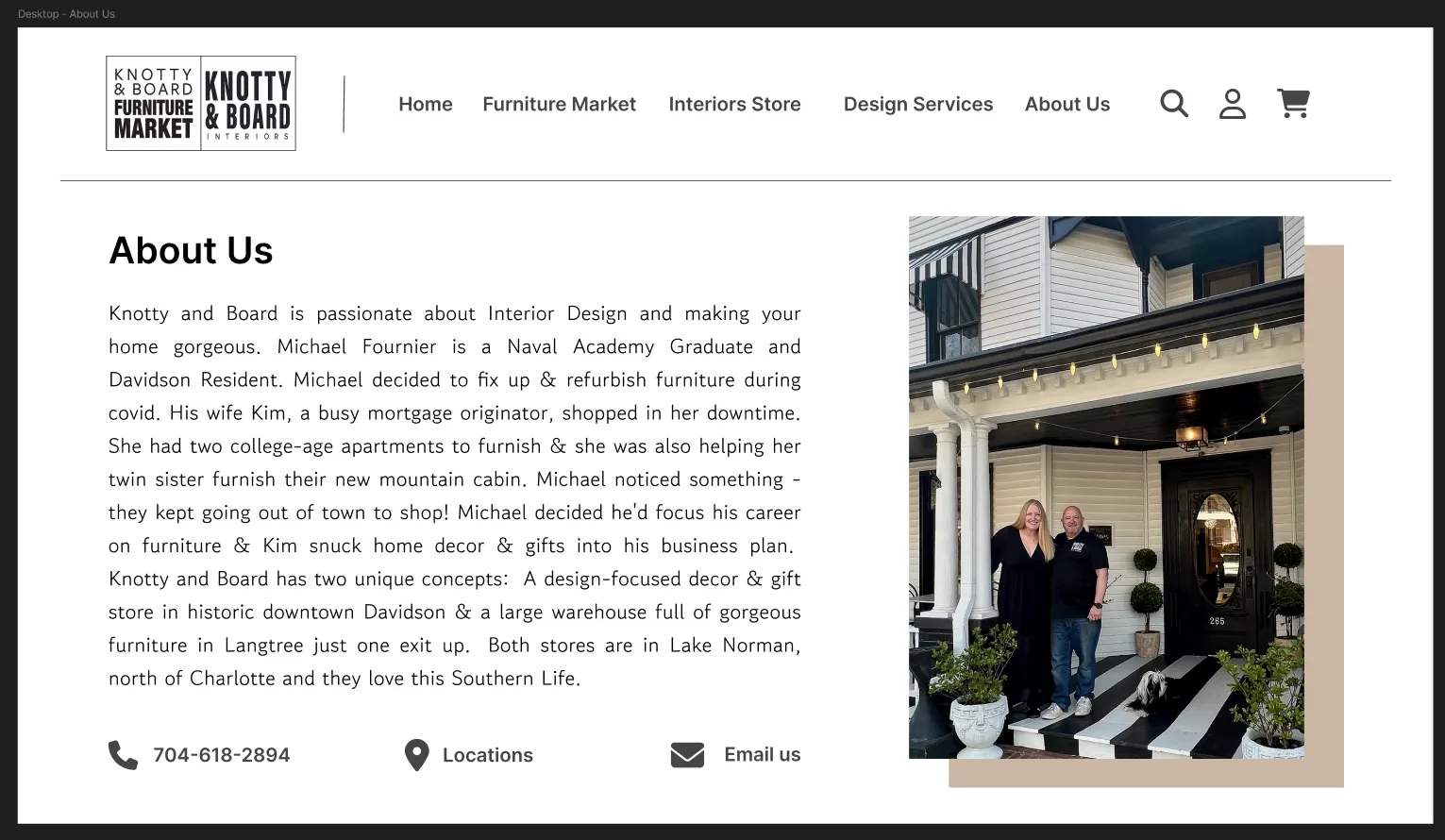
Desktop “About Us” Figma design
When creating our desktop design in Figma, we ensured that there was sufficient contrast for all of the text, while maintaining the muted color palette. We also kept pictures from their current website to showcase their selection of furniture and decor. We made their contact information and location easily accessible, creating a seamless process for users interested in purchasing products from Knotty & Board.
Multi-touch Display Designs:
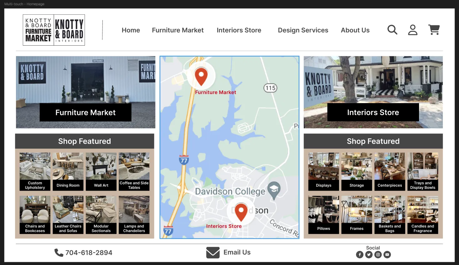
Multi-touch display homepage Figma design
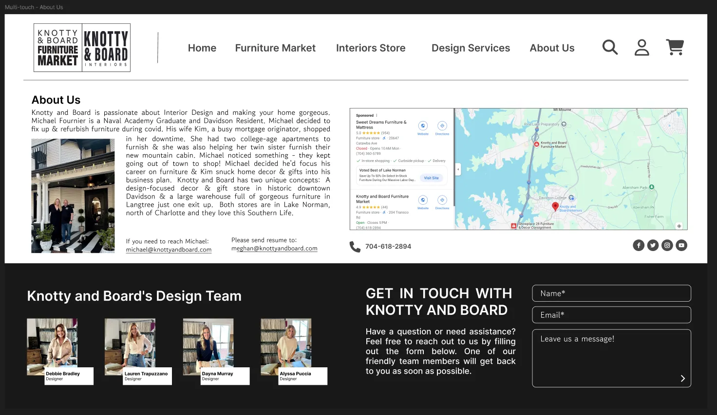
Multi-touch display “About Us” Figma design
Our large multi-touch display designs build upon our desktop layouts, utilizing the increased screen size to improve the user’s experience. We introduced “Shop Feature” sections on the homepage, allowing users to browse specific categories directly, without having to go to a new page. We integrated a large map into the center of the page to help customers plan transportation, as Knotty & Board does not ship furniture. On the “About Us” page, we incorporated information about the design team, which added a personal touch, and it provided users with more insights into the company.
Apple Watch Designs:
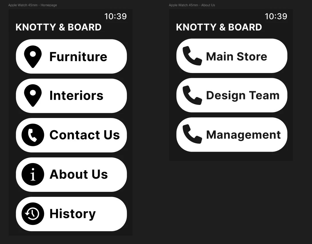
Figma designs for Apple Watch homepage and “About Us” page
Our Apple Watch designs kept the essential features of our desktop and multi-touch designs, while also fitting onto the much smaller, wearable format. The homepage presents store locations, contact information, and purchase history. The “About Us” page now acts as a contact page so that the user can call any of the departments. Given the limited screen space, we opted for a minimal color palette to increase the readability and focus.
In-class Demo:
After creating our initial designs in Figma, we presented them to our class for feedback. We received two main critiques: first, the lower section on our “About Us” multi-touch display design appeared more like a footer than a full section; second, the images on our homepage desktop did not properly distinguish between the two stores. Taking this feedback into consideration, we redesigned these two pages. For the homepage desktop, we created two distinct sections with clear visual separation between the two stores, adding to the dividing line. On the “About Us” multi-touch display page, we revised the color scheme to establish the “Design Team” and “Get in Touch” areas as fully-fledged sections rather than a footer.
Revised Designs:
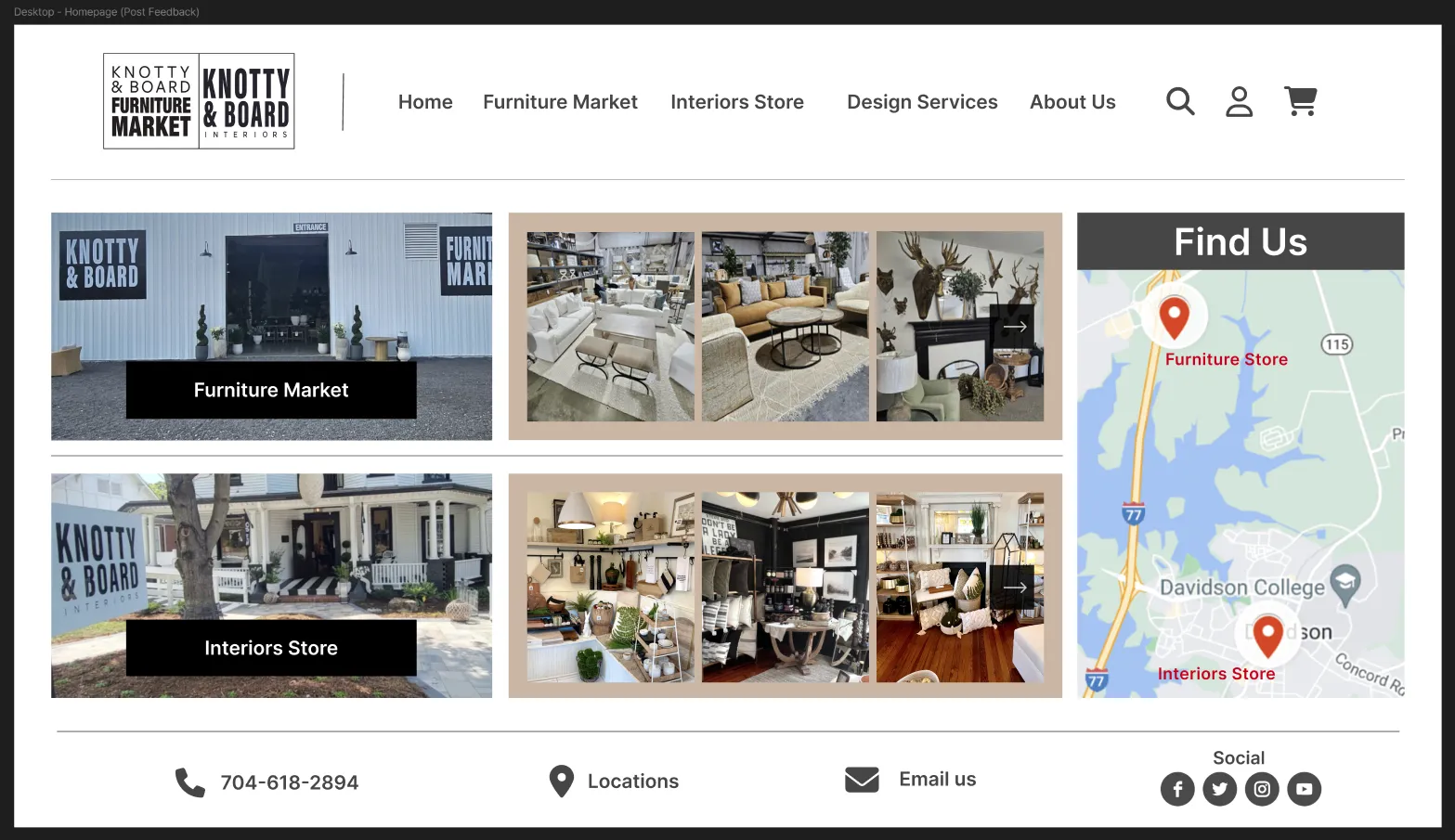
Desktop homepage design post-feedback
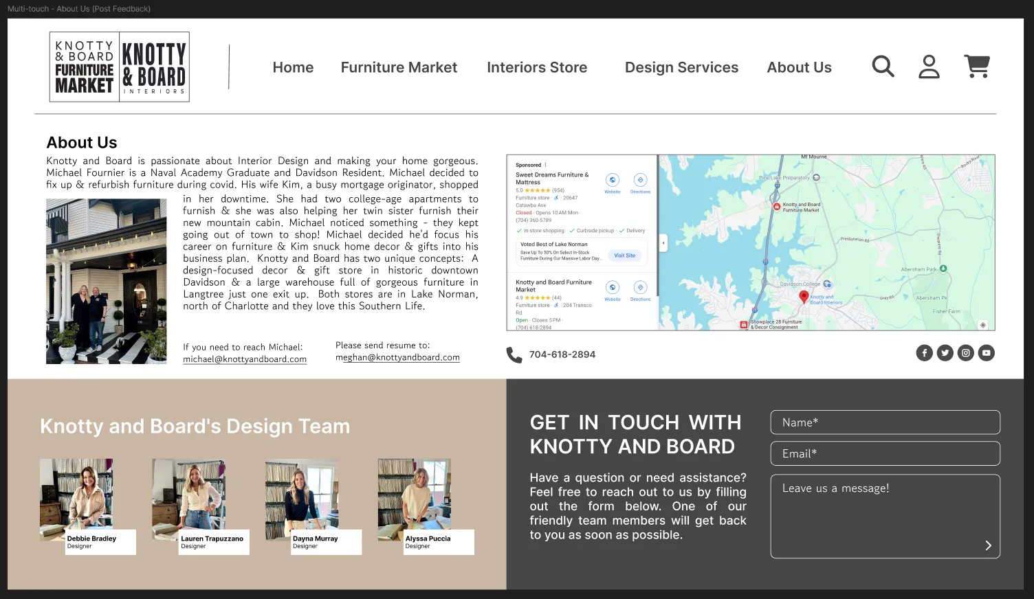
“About Us” multi-touch display design post-feedback
Design Reflections:
Reflecting on our design process, we recognize both the strengths of our approach and areas for potential improvement. In reality, the target audience for this website would not be using multi-touch displays and smart watches to shop. Instead, they would mostly be using computers, tablets, and maybe phones. While we had to keep the additional page consistent among multiple devices (i.e. redesigning the “About Us” page on all screen sizes), those devices could be used in more creative ways. We imagined that the watch could track deliveries (at least the ones that Knotty & Board offer) and allow the user to check out when they are away from their computer. For the large multi-touch display, we would utilize its size and touch inputs so that the user could view a large, 3D-rendered version of products. This would allow customers to get a better view of products without having to see them in person.
If given more time, we would prioritize gathering feedback from actual end-users rather than relying on classmate input. This approach would allow us to receive more informative critiques, as our classmates are not typically shopping for furniture or interior decor. Additionally, we would implement user testing rather than demoing our designs. This would allow us to see whether or not our design is intuitive or not. Lastly, we would spend more time iterating on our designs. We did not have much time after our in-class demo to make changes. In an ideal world, we would make more changes and then have another session for critiques.
If given more time, we would prioritize gathering feedback from actual end-users rather than relying on classmate input. This approach would allow us to receive more informative critiques, as our classmates are not typically shopping for furniture or interior decor. Additionally, we would implement user testing rather than demoing our designs. This would allow us to see whether or not our design is intuitive or not. Lastly, we would spend more time iterating on our designs. We did not have much time after our in-class demo to make changes. In an ideal world, we would make more changes and then have another session for critiques.
Conclusion:
We analyzed the Knotty & Board webpage and found potential issues on the page. After developing personas for possible users of the website, we redesigned key pages to better suit their needs. This design sprint allowed us to iteratively sketch, prototype, and design multiple web pages for desktop, large multi-touch displays, and Apple Watch in a small timeframe. We reimagined their homepage to showcase products more effectively and revamped the “About Us” page to provide clearer company information, and we adapted each design to leverage the strengths of different screen sizes. Additionally, we gained experience in presenting to an audience and receiving feedback to improve our design further. While there are areas for improvement in our design process, we created an intuitive design for the Knotty & Board website.