Introduction
In our previous design sprint, we created digital visualizations exploring the relationships between college students’ mental health, sleep patterns, GPA, and exercise habits. Now, we aim to evaluate and transform these insights into physical forms that enhance accessibility and engagement. Our goal is to create tangible representations that allow users to interact with the data in new, meaningful ways while maintaining the clarity of our original findings.
Analytical Prototyping
Our analytical physicalization journey began with extensive ideation and iteration. Initially, we explored the concept of a traditional 3D bar graph using LEGO blocks, where each stack would represent different variables like sleep hours or GPA ranges. However, as we realized our dataset’s complexity, we decided to have a more comprehensive solution that could effectively display the interconnected nature of our four key variables: GPA, sleep patterns, exercise frequency, and financial stress.
Through multiple design iterations, we evolved from a simple bar graph concept to a more sophisticated 4D representation. Our first prototype idea utilized LEGO blocks for their familiarity and ease of manipulation, with each stack representing different data ranges. While this approach offered good interactivity, we felt it didn’t fully capture the relationships between all our variables. We then explored using simple, minimalist blocks (potentially 3D-printed or wooden) to create a more professional and cohesive look while maintaining the tactile engagement aspect.
Our final design concept emerged as a square platform where each edge represents one of our four key variables, creating a multi-dimensional data visualization. The design uses stackable blocks rising from the base, with each stack’s height indicating stress levels or frequency of responses. We chose this approach for several compelling reasons:
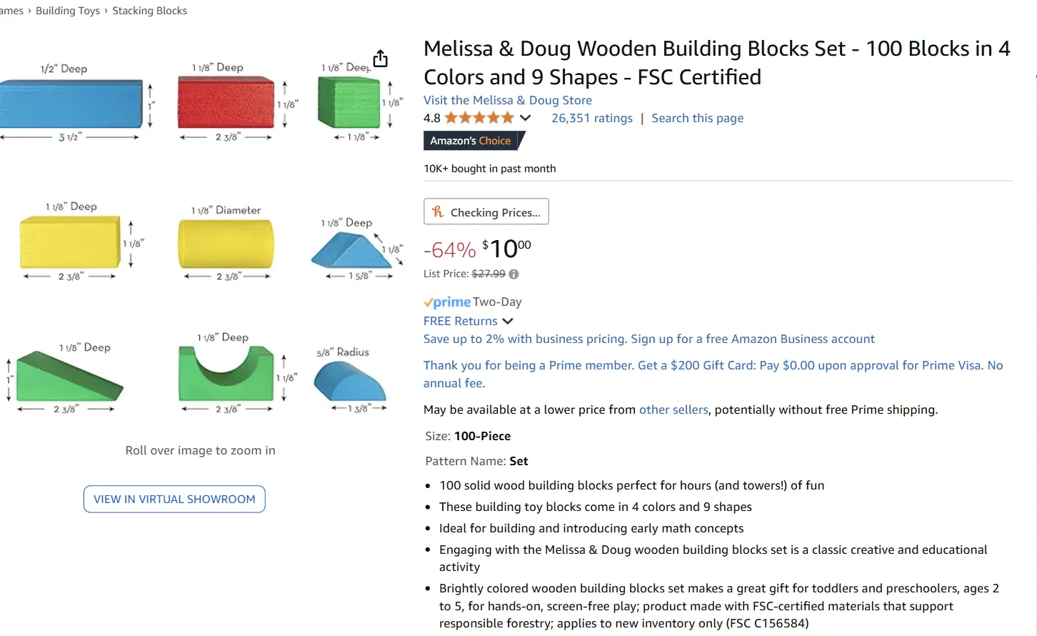
At this stage, we were in the development phase of this design. We explored various materials and construction methods to optimize both durability and user experience. We considered using either custom 3D-printed blocks or pre-manufactured acrylic cubes for the stackable elements and a sturdy wooden or acrylic base for the platform. Visual concepts of our design and potential building materials have been sourced from various suppliers, including Amazon, to ensure feasibility and quality.
Through multiple design iterations, we evolved from a simple bar graph concept to a more sophisticated 4D representation. Our first prototype idea utilized LEGO blocks for their familiarity and ease of manipulation, with each stack representing different data ranges. While this approach offered good interactivity, we felt it didn’t fully capture the relationships between all our variables. We then explored using simple, minimalist blocks (potentially 3D-printed or wooden) to create a more professional and cohesive look while maintaining the tactile engagement aspect.
Our final design concept emerged as a square platform where each edge represents one of our four key variables, creating a multi-dimensional data visualization. The design uses stackable blocks rising from the base, with each stack’s height indicating stress levels or frequency of responses. We chose this approach for several compelling reasons:
- •Comprehensive Data Representation: The four-sided platform allowed us to display all key variables simultaneously, enabling users to observe relationships from multiple angles.
- •Interactive Learning: Users could physically manipulate the blocks, making the data exploration process more engaging and memorable.
- •Accessibility: We incorporated high-contrast colors and tactile markers on the blocks to ensure accessibility for users with various needs.
- •Flexibility: The modular nature of the blocks allowed for easy updates and modifications to represent different data scenarios.
- •Visual Impact: The three-dimensional structure created an immediate visual impact, drawing users in and encouraging exploration of the data relationships.
At this stage, we were in the development phase of this design. We explored various materials and construction methods to optimize both durability and user experience. We considered using either custom 3D-printed blocks or pre-manufactured acrylic cubes for the stackable elements and a sturdy wooden or acrylic base for the platform. Visual concepts of our design and potential building materials have been sourced from various suppliers, including Amazon, to ensure feasibility and quality.
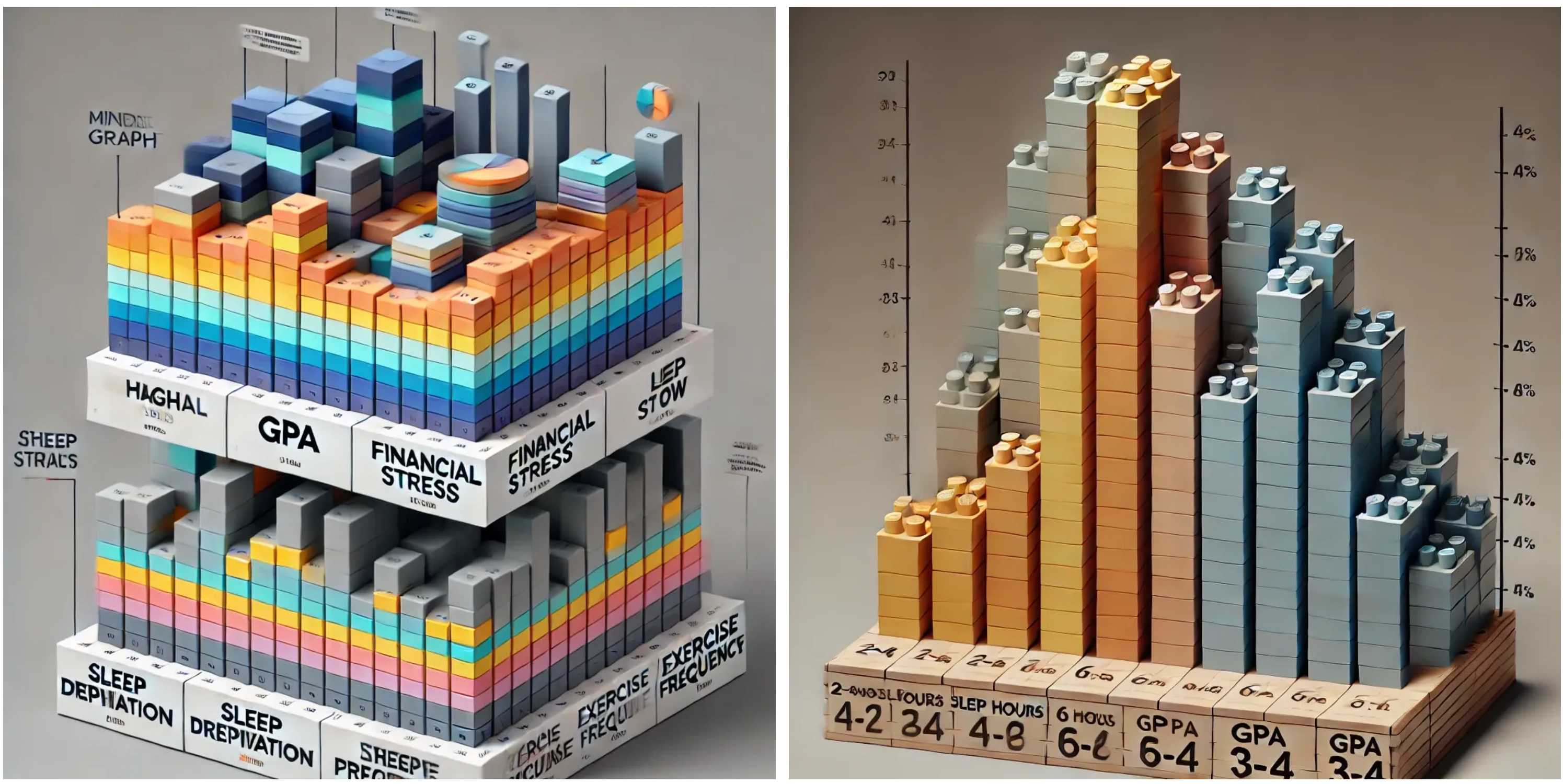
New “4D” bar graph concept on the left and the 3D bar graph concept on the right
Persuasive Prototyping
For the persuasive physicalization, we took inspiration from the original persuasive visualization that uses an alarm clock and decided to design something similar that depicts data related to mental health. We briefly debated between using a digital or analog clock as our base and ultimately decided to use an analog clock because it could be more expressive. Here is the concept sketch for our physicalization:
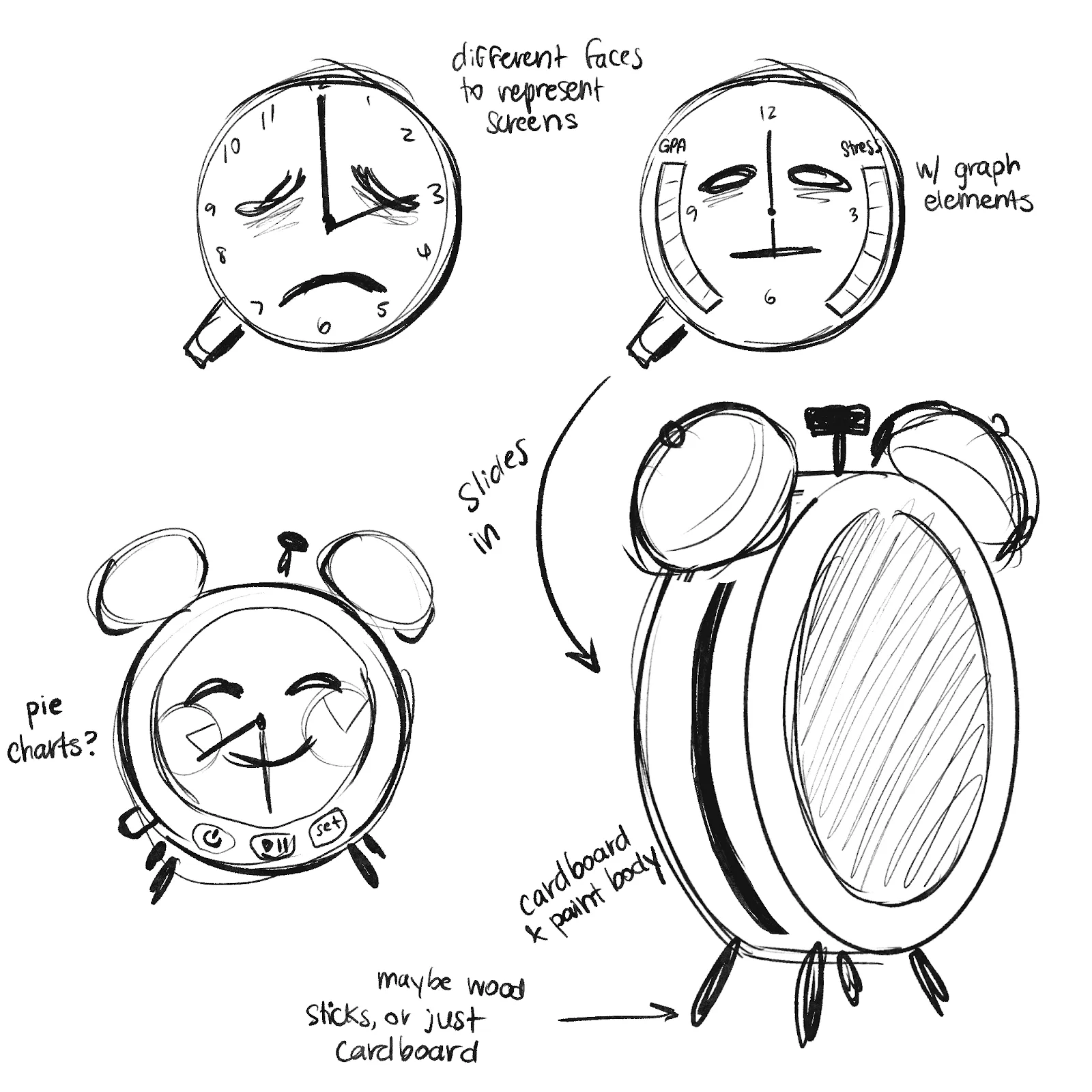
Clock Sketch
We planned to create the main structure of the clock out of cardboard and keep a slot open on the side to allow different face/’screen’ options to slide in. These different faces would display the time, an expression relative to how many hours of sleep the person would have gotten, and data related to the mental health of students in the same range of hours of sleep. We initially planned to include data related to the CGPA of the students, but it was difficult to fit in that much information.
To accurately represent our data, we need 3 faces for the time ranges of sleep. Since the faces are interchangeable, we could experiment with these data representations quite a bit. The main body would also have buttons that represent the different ‘modes’ the clock would have. We planned to have:
To make this design more accessible, we also decided to implement a mode that would change the alarm sound to a vibration, more similar to a vibrating alarm clock. Additionally, the clock would read the data aloud by default (and this could be muted with a mute button, similar to self-checkout machines).
To accurately represent our data, we need 3 faces for the time ranges of sleep. Since the faces are interchangeable, we could experiment with these data representations quite a bit. The main body would also have buttons that represent the different ‘modes’ the clock would have. We planned to have:
- •Auto mode: Similar to the original visualization, this would start at 12 AM and accelerate through time, stopping to play an alarm at the end of each time range and displaying the associated data. This mode would use the play/pause button and the later-added forward/back buttons.
- •Set mode: The user can input how long they sleep on average, and the clock face would change to display data for others in this range. This mode would allow the user to make a more direct connection with their own sleep habits and maybe even compare their mental health to the displayed data.
To make this design more accessible, we also decided to implement a mode that would change the alarm sound to a vibration, more similar to a vibrating alarm clock. Additionally, the clock would read the data aloud by default (and this could be muted with a mute button, similar to self-checkout machines).
Evaluation Methodology for Prototypes
To inform our design process and gather insights for our final physicalization, we conducted a user study with two college students, focusing on our initial prototypes and concepts. Through structured interviews, we aimed to understand how users interact with and interpret physical representations of mental health data.
Interview Structure
We developed six core questions spanning different aspects of user interaction and understanding:
Participant Profile and Setting
We interviewed two students who brought different perspectives to our evaluation. Let us call them Alex and Maya for anonymity purposes. Alex, a junior in Computer Science, approached the visualizations with a technical mindset, while Maya, a senior Mathematics major, offered insights particularly focused on data representation and accessibility.
Initial Feedback on Early Prototypes
The LEGO-Based Analytical Model: Our first prototype using LEGO blocks received mixed responses. Alex noted, “I like how I can see everything at once, but the construction feels makeshift, and I’m not sure what some of these heights represent without labels.” He also pointed out that since we have a large number of categories in our dataset, we should go with an option that represents as much data as possible for it to be diverse.
Maya focused on the potential of physical interaction: “Being able to touch and compare the different tower heights helps me understand the relationships better than a screen would. But I wish I knew exactly what measurements each height represented.” She also pointed out the color usage, suggesting we could improve the accessibility by using more pronounced colors. Maya added that we should also consider better materials for the platform, something sturdier than cardboard for the foundation.
The Initial Alarm Clock Concept: For our cardboard-based alarm clock prototype, Maya expressed enthusiasm about the concept while pointing out practical concerns: “The idea of sleep patterns and performance is powerful, but I’m not sure how visible it will be in terms of coloring and space.”
Alex’s feedback also centered on functionality and clarity: “The data representations could be clearer, like what kind of graph are you planning to use, and is it going to fit inside it?”
Key Insights for Redesign
Through these interviews, several crucial themes emerged, including material quality, data clarity, accessibility, and interactive elements, and we acted on them to get a better final design:
Analytical Model: As Alex pointed out the need for more data showcase, we had a more conservative option of having a grid-like platform with only two correlated categories, like CGPA and Sleep scores, and another more ambitious one presenting multiple data categories for each side of the rectangular platform. We also added the titles for each category in the center of our platform, and we used markers to label the height of each tower.
What Maya said really put an emphasis on how well we can represent the data, given that statistically averages look similar to each other, and since we have blocks that are integer-like, it really made us think more. So, we decided to upscale some differences to better present them, something we discuss in our data preparation part. Based on her comment on accessibility, we removed purple cubes, which apparently are more likely to cause problems for people with specific types of color blindness. Thus, we used main colors RGB (red, green, and blue) and yellow representing each category separately.
For the materials, we went from a cardboard base idea to wrapping a book in multiple layers of hard colored paper and also trying to hide some taping by making it two-ended and sticking one more layer on top.
Persuasive Model: The feedback focused on visibility and spacing from both participants. So, we decided to stay with cardboard material but paint it red to make it more appealing. We also agreed on multiple switchable cardboard plates to go in and out of the clock to show more data and use visible colors while having multiple curved ratio bars for even more data representation.
Overall, these insights directly informed our development of both the 5D data visualization and the refined alarm clock design, leading to improvements in materials, clarity, and user interaction.
Interview Structure
We developed six core questions spanning different aspects of user interaction and understanding:
- 1. “Looking at this visualization, what do you think it represents, and how do the different parts relate to each other?”
- 2. “How does the physical nature of this visualization affect your understanding of the data compared to a traditional screen-based graph?”
- 3. “How well does the physical structure match your expectations of how these factors (sleep, CGPA, mental health) relate to each other?”
- 4. “What challenges might different users face when interacting with this visualization, and how could we address them?”
- 5. “How engaging do you find this physical representation, and would you use something like this to explore mental health data?”
- 6. “What would you change about this visualization to make it more effective?”
Participant Profile and Setting
We interviewed two students who brought different perspectives to our evaluation. Let us call them Alex and Maya for anonymity purposes. Alex, a junior in Computer Science, approached the visualizations with a technical mindset, while Maya, a senior Mathematics major, offered insights particularly focused on data representation and accessibility.
Initial Feedback on Early Prototypes
The LEGO-Based Analytical Model: Our first prototype using LEGO blocks received mixed responses. Alex noted, “I like how I can see everything at once, but the construction feels makeshift, and I’m not sure what some of these heights represent without labels.” He also pointed out that since we have a large number of categories in our dataset, we should go with an option that represents as much data as possible for it to be diverse.
Maya focused on the potential of physical interaction: “Being able to touch and compare the different tower heights helps me understand the relationships better than a screen would. But I wish I knew exactly what measurements each height represented.” She also pointed out the color usage, suggesting we could improve the accessibility by using more pronounced colors. Maya added that we should also consider better materials for the platform, something sturdier than cardboard for the foundation.
The Initial Alarm Clock Concept: For our cardboard-based alarm clock prototype, Maya expressed enthusiasm about the concept while pointing out practical concerns: “The idea of sleep patterns and performance is powerful, but I’m not sure how visible it will be in terms of coloring and space.”
Alex’s feedback also centered on functionality and clarity: “The data representations could be clearer, like what kind of graph are you planning to use, and is it going to fit inside it?”
Key Insights for Redesign
Through these interviews, several crucial themes emerged, including material quality, data clarity, accessibility, and interactive elements, and we acted on them to get a better final design:
Analytical Model: As Alex pointed out the need for more data showcase, we had a more conservative option of having a grid-like platform with only two correlated categories, like CGPA and Sleep scores, and another more ambitious one presenting multiple data categories for each side of the rectangular platform. We also added the titles for each category in the center of our platform, and we used markers to label the height of each tower.
What Maya said really put an emphasis on how well we can represent the data, given that statistically averages look similar to each other, and since we have blocks that are integer-like, it really made us think more. So, we decided to upscale some differences to better present them, something we discuss in our data preparation part. Based on her comment on accessibility, we removed purple cubes, which apparently are more likely to cause problems for people with specific types of color blindness. Thus, we used main colors RGB (red, green, and blue) and yellow representing each category separately.
For the materials, we went from a cardboard base idea to wrapping a book in multiple layers of hard colored paper and also trying to hide some taping by making it two-ended and sticking one more layer on top.
Persuasive Model: The feedback focused on visibility and spacing from both participants. So, we decided to stay with cardboard material but paint it red to make it more appealing. We also agreed on multiple switchable cardboard plates to go in and out of the clock to show more data and use visible colors while having multiple curved ratio bars for even more data representation.
Overall, these insights directly informed our development of both the 5D data visualization and the refined alarm clock design, leading to improvements in materials, clarity, and user interaction.
Final Physicalizations
Data Preparation for Analytical Physicalization
To successfully represent data for our idea with multiple data dimensions, we transformed raw mental health indicators into a format suitable for a five-dimensional physical model. CGPA categories served as the base dimension, complemented by financial concerns, isolation levels, sports engagement, and sleep hours.
Our dataset contained CGPA ranges, financial concern ratings (1–5 scale), sports participation frequency, sleep duration patterns, and isolation scores (1–5 scale). The challenge was transforming these diverse data types into a unified, physically representable format while maintaining relationship integrity.
We established four CGPA categories (2.0–2.5, 2.5–3.0, 3.0–3.5, and 3.5–4.0) as our foundation, creating a separate category for undefined data. Financial concerns and isolation metrics required minimal processing beyond calculating averages. Sports engagement was converted from descriptive categories to numerical values (0 for no sports to 3 for 7+ times), while sleep duration was standardized (2–4 hours = 3, 4–6 hours = 5, 7–8 hours = 7).
We also implemented a normalization process to translate data into constructable cube stacks. All features were normalized to a 0–10 scale while preserving original ranges. To ensure visible differences, we multiplied normalized values by 2, maintaining proportional relationships while creating pronounced variations in cube heights.
Final Analytical Model
Our final analytical physicalization features a 10 by 8 inches rectangle platform, with each base edge corresponding to a CGPA range. Within each quadrant, four distinct wooden cube towers represent sleep patterns, financial stress, sports engagement, and isolation scores. The color-coding system uses yellows for sleep, reds for financial stress, greens for sports engagement, and blues for isolation, with tactile surfaces and measurement labels marked at each base.
Based on user feedback during the presentation phase, we added measurement labels, like “Hours” for sleep category, “# of Exercises” for sports engagements, and “Scores” for financial concerns and isolation. So, now the design incorporates removable tower blocks and clear labeling for measurement and category names.
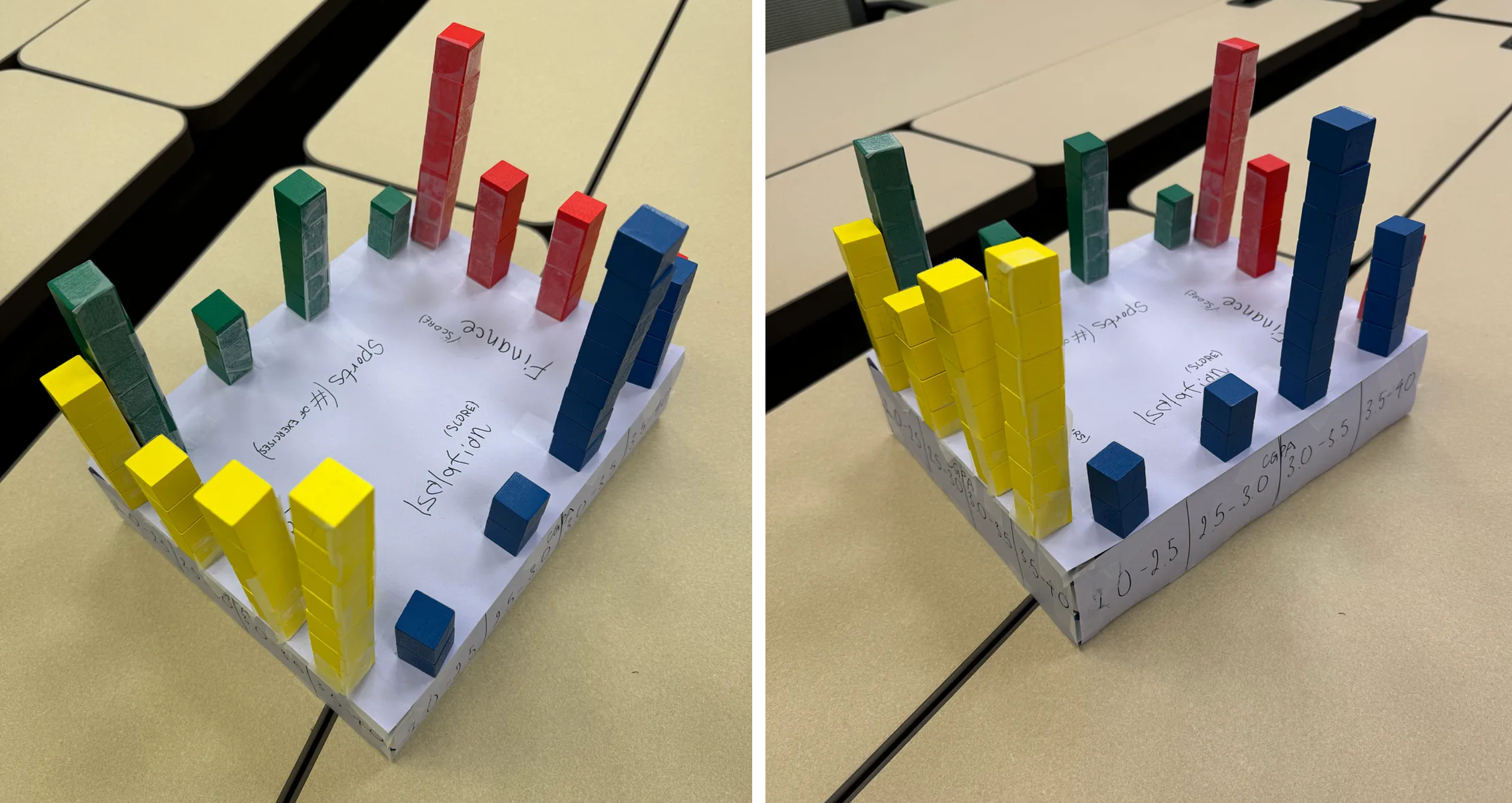
Final Physical Design
The result transforms complex mental health data into an accessible, interactive experience while maintaining data integrity and interpretability through careful preparation and thoughtful physical design.
Final Persuasive Model
We started constructing the clock by drawing the pieces we would need onto cardboard and cutting these pieces out with a box cutter. We used various round objects (lids, containers, etc…) to draft the circles and scored along the long piece that would later be bent to allow easier bending.
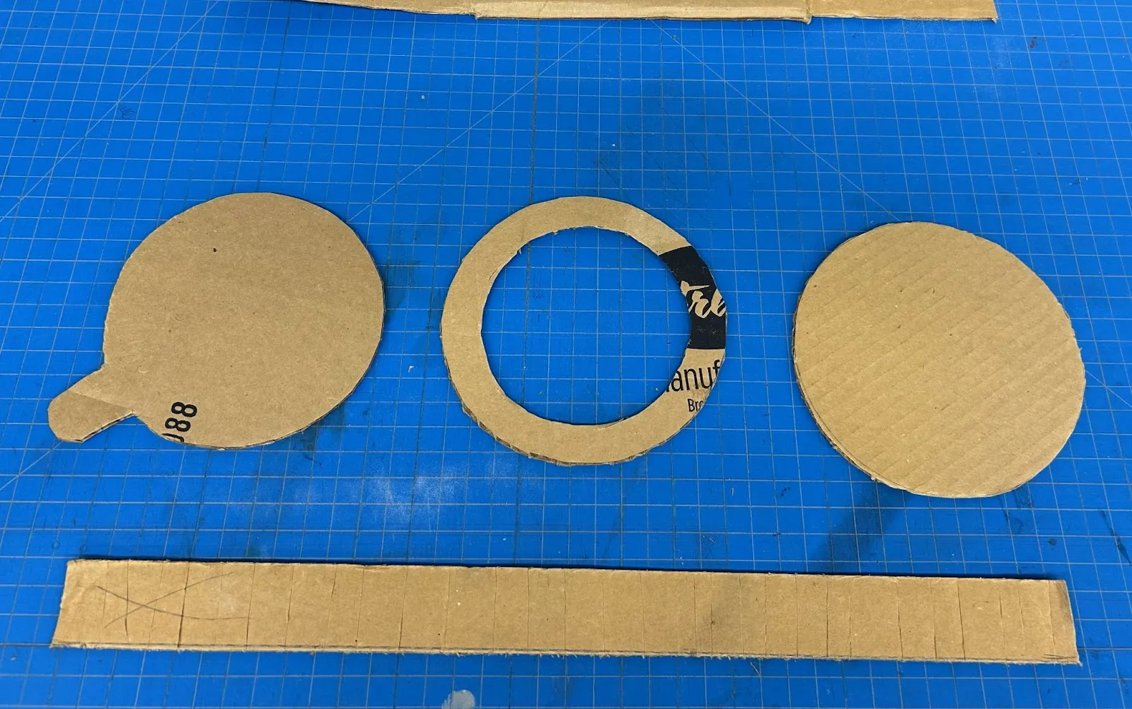
Pieces Cut Out
Once the pieces were cut out, they could be painted. We decided to make the clock body red since a lot of analog alarm clocks are red, and a lot of digital alarm clocks use red text, so it felt like the most recognizable color for an alarm clock. At this stage we also measured how big the slot should be and cut that out as well.
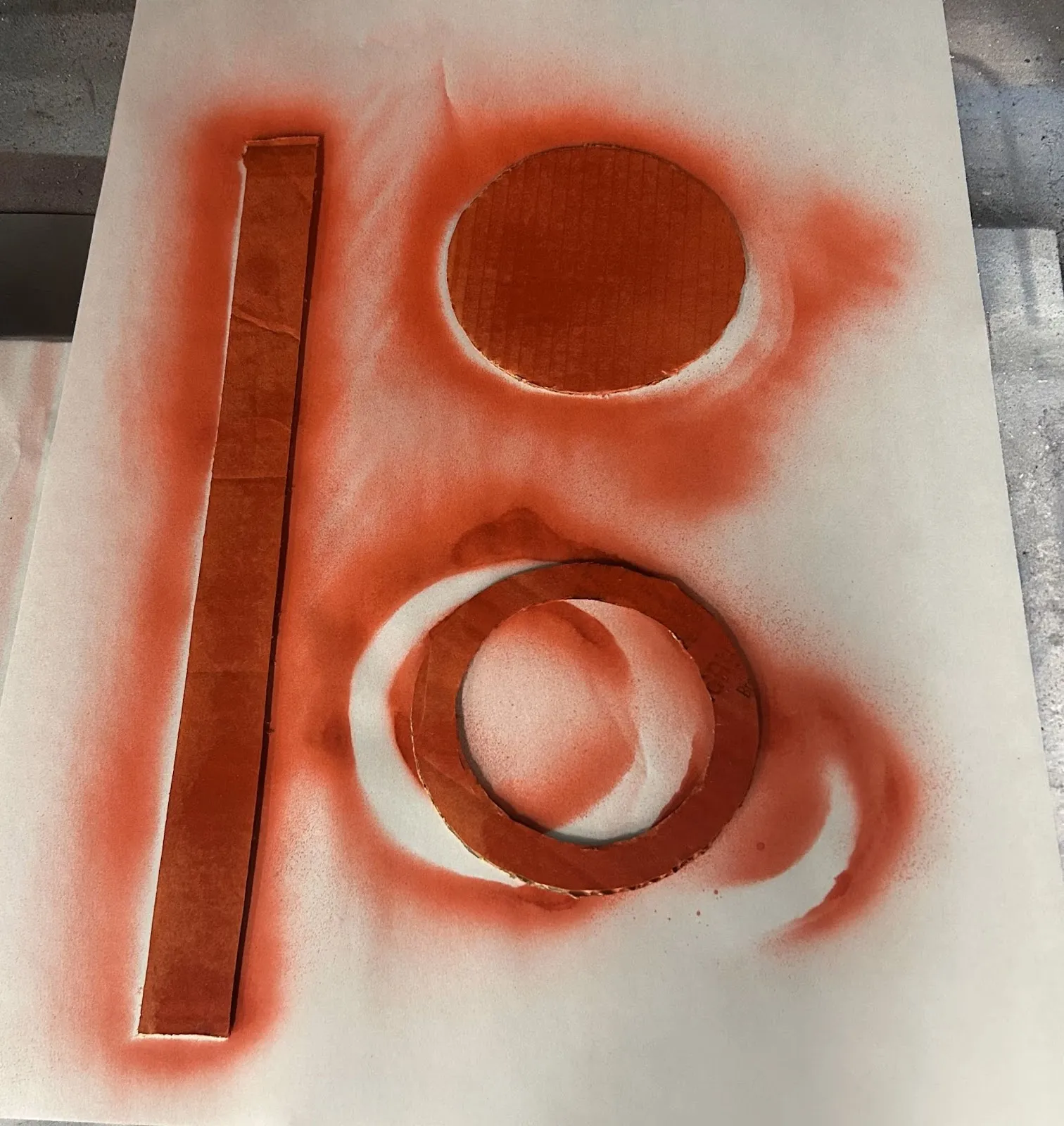
Spray-Painted Pieces
Next we assembled the pieces using tape to get the basic shape, and then we used hot glue to reinforce the body. We covered the edges with ribbon to hide the glue and edges of the cardboard.
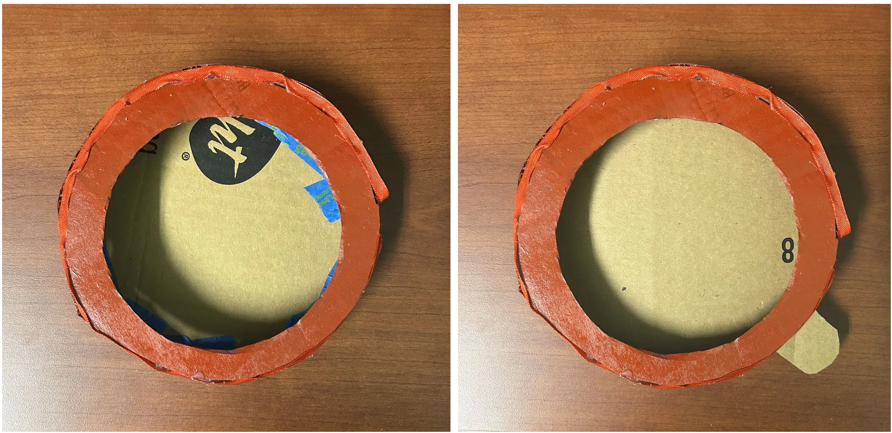
Main clock body with unpainted ‘screen’
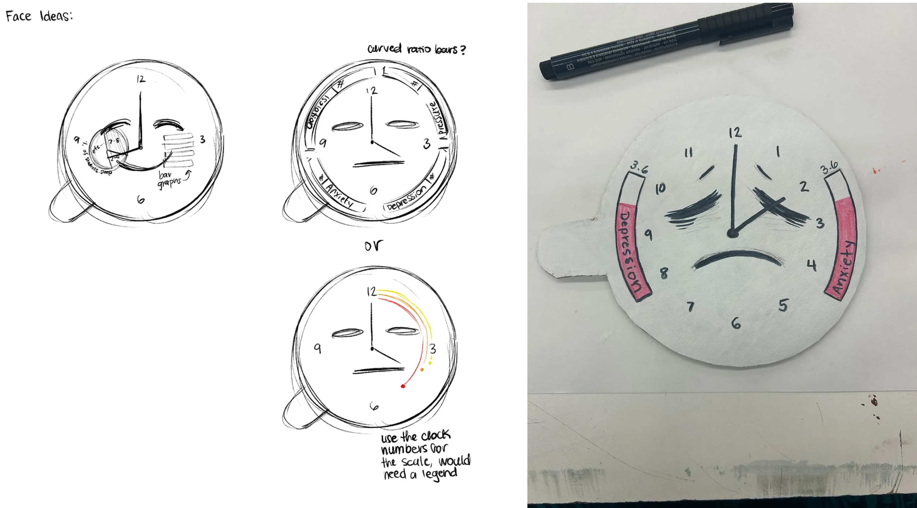
Once the body was finished, we shifted our focus back to the faces and created more sketches to nail down the final design.
Sketches and Physical Test Face
After creating a test face and some more sketches, we got feedback from peers on which face design would best represent the data, and we found that the top right design would be the easiest to interpret. Once all the faces were painted, the legs and bells were added to finish the clock. We used real bells since it would make an actual sound similar to a real alarm clock and add to the interactivity.

Final Physicalization Design
We received feedback from our peers on the current design, and they would like to see more accessibility functions and a more clear indicator of the sleep time frame the data represents. Additionally, we would need to conduct a usability test to see what the specific weak points are in the design that need more accessibility functionality. For now we identified several existing concerns with the current design:
- •Visibility: The numbers in the bar graphs are quite small and can be hard to read.
- •Read Aloud Function: Some users may find the read-aloud function distracting or may want to mute the read-aloud but not the alarm sound. The current mute button is intended to mute the entire device, but there may be a need for multiple buttons to mute just one portion of the clock.
- •Color Choice: The usage of color in the bar graphs to show improvement was unclear for some people already, and additionally these colors may not have the same association between cultures.
Conducting additional usability tests would allow us to explore these concerns and find any other possible problems with the current design and how different people interact with it.
Conclusion
Our path from initial concept to final physicalization demonstrates the power of transforming mental health data into tangible, interactive experiences. Through careful data preparation, iterative prototyping, and user feedback, we created two distinct physical visualizations that make complex relationships in student mental health data more accessible and engaging.
The analytical model successfully represents multidimensional data through its platform design and color-coded tower system, while the persuasive alarm clock model effectively communicates the impact of sleep patterns on student well-being. Both designs prioritize accessibility and user interaction.
For a detailed demonstration of our physical prototypes and their interactive features, we invite you to view our one-minute demo video.